Writing Components That Work In Any Frontend Framework
First published: 05/11/2023
The browser has a built-in way of writing reusable components in the form of web components. They’re an excellent choice for building interactive, and reusable components that work in any frontend framework. With that said, writing highly interactive and robust web components isn’t simple. They require a lot of boilerplate and feel much less intuitive than the components you may have written in frameworks like React, Svelte, and Vue.
In this article, I’ll give you an example of an interactive component written as a web component, and then refactor it using a library that softens the edges and removes heaps of boilerplate.
Don’t sweat if you’re not familiar with web components. In the next section, I’ll do a (very brief and limited) overview of what web components are, and what they’re made out of. If you have some basic experience with them, you can skip the next section.
What are web components?
Before web components, the browser didn’t have a standard way of writing reusable components. Many libraries solve this problem, but they often run into limitations like performance, interoperability, and issues with web standards.
They’re a technology made up of 3 different browser features:
- Custom elements
- Shadow DOM
- HTML Templates
We’ll do a quick crash course of these technologies, but it’s by no means a comprehensive breakdown.
Custom Elements
With Custom Elements you can author your own custom HTML elements that you can reuse across your site. They can be as simple as text, images, or visual decorations. You can push them further and build interactive components, complex widgets, or entire web applications.
You’re not just limited to using them in your projects, but you can publish them and allow other developers to use them on their sites.
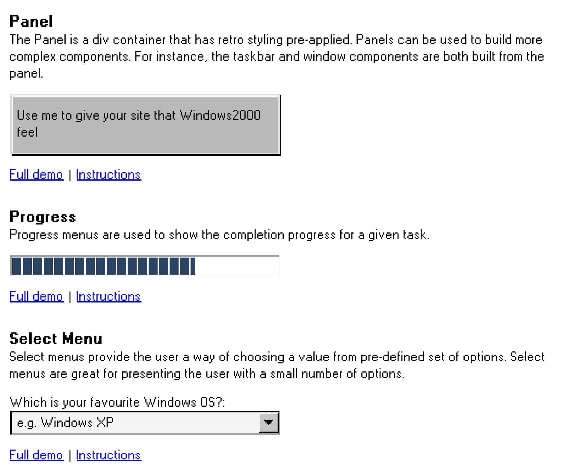
Here are some of the reusable components from my library A2K. You can see that they come in all shapes and sizes, and have a range of different functionalities. Using them in your projects is similar to using any old HTML element.
Here’s how you’d use the progress element in your project:
<!DOCTYPE html>
<html>
	<head>
		<title>Quick Start</title>
		<meta charset="UTF-8" />
	</head>

	<body>
		<!-- Use web components in your HTML like regular built-in elements. -->
		<a2k-progress progress="50" />

		<!-- a2k web components use standard JavaScript modules. -->
		<script type="module">
			import 'https://cdn.jsdelivr.net/npm/@a2000/progress@0.0.5/lib/src/a2k-progress.js';
		</script>
	</body>
</html>
Once you’ve imported the third-party scripts, you can start using the component, a2k-progress in this case, just like any other HTML element.
If you’re building your own web components, there’s virtually no limit to how complex you can make your custom elements. I recently created a web component that renders a CodeSandbox code editor in the browser. And because it’s a web component, you can use it in any framework you like! If you’d like to learn a little more about that, you can read more here.
Shadow DOM
If you have a working knowledge of CSS, you’ll know that vanilla CSS is scoped globally. Writing something like this in your global.css:
p {
	color: tomato;
}
Will give all p elements a nice orange/red color, assuming that no other, more specific CSS selectors are applied to a p element.
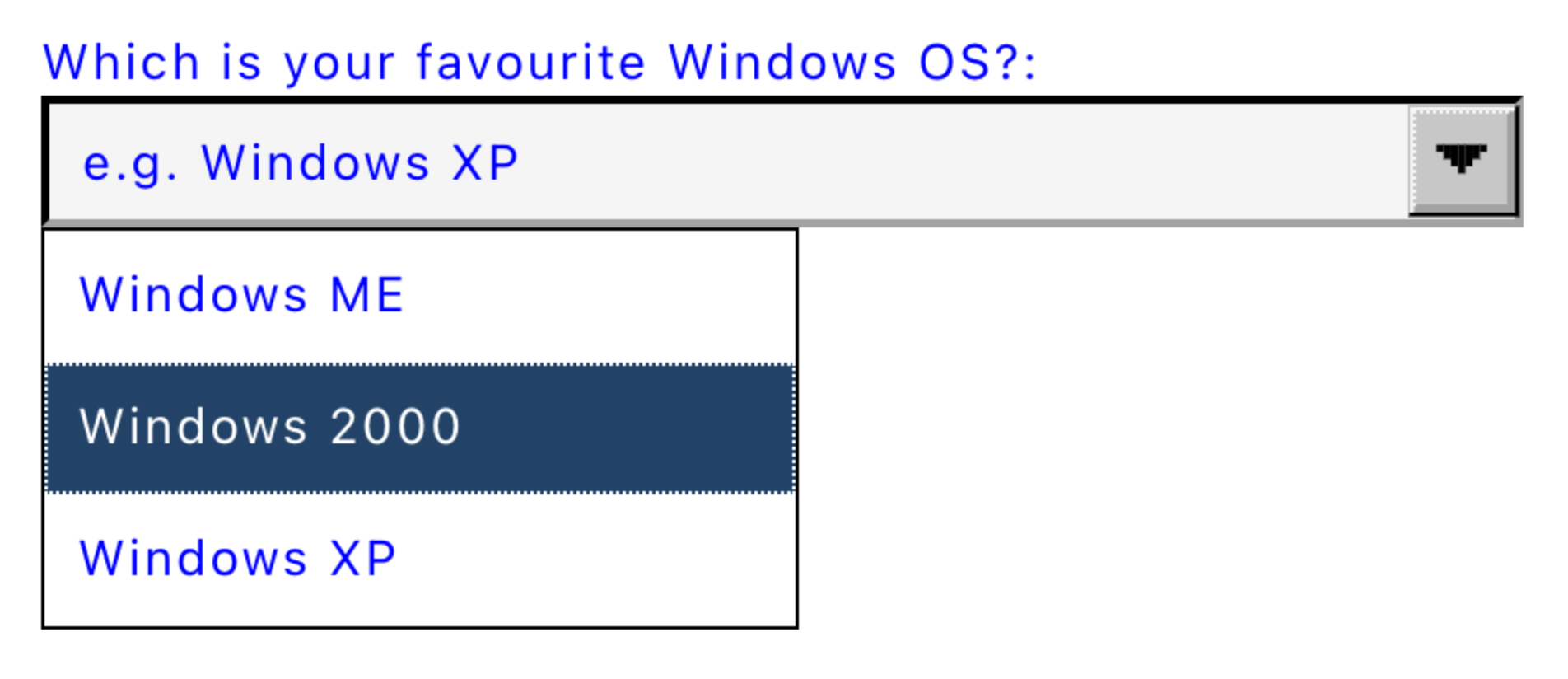
Take this select menu for example:
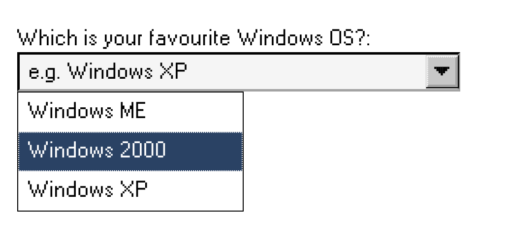
It has a distinct character which is driven by the visual design. You might want to use this component, but if your global styles affect things like the font family, the color, or the font size, it could cause issues with the appearance of the component:
<head>
	<style>
		body {
			color: blue;
			font-size: 12px;
			font-family: system-ui;
		}
	</style>
</head>

<body>
	<a2k-select></a2k-select>
</body>
This is where the Shadow DOM comes in. The Shadow DOM is an encapsulation mechanism that prevents the rest of the DOM from interfering with your web component, this ensures that the global styles of the web application don’t interfere with any components that you consume. It also means that component library developers can author their components with the confidence that they’ll look and behave as expected across different web applications.
There’s a lot more nuance when it comes to the Shadow DOM, as well as other features that we’re not going to touch on in this article. If you’d like to learn more about web components though, I have an entire course (Component Odyssey) dedicated to teaching you how to build reusable components that work in any framework.
HTML Templates
The last feature in our whistle-stop tour of web components features is HTML Templates.
What makes this HTML element different from other elements, is that the browser doesn’t render its content to the page. If you were to write the following HTML you wouldn’t see the text “I’m a header” displayed on the page:
<body>
	<template>
		<h1>I'm a header</h1>
	</template>
</body>
Instead of being used to render the content directly, the content of the template is designed to be copied. The copied template can then be used to render content to the page. You can think of the template element much like the template for a 3D print. The template isn’t a physical entity, but it’s used to create real-life clones.
You would then reference the template element in your web component, clone it, and render the clone as the markup for your component.
I won’t spend any more time on these web component features, but you’ve probably already noticed that to write vanilla web components, there are a lot of new browser features that you need to know and understand. You’ll see in the next section that the mental model for building web components doesn’t feel as streamlined as it does for other component frameworks.
A Basic Web Component
Now that we’ve briefly covered the fundamental technologies powering a web component, here’s how to build a hello world component:
const template = document.createElement('template');
template.innerHTML = `<p>Hello World</p>`;

class HelloWorld extends HTMLElement {
	constructor() {
		super();
		this.attachShadow({ mode: 'open' });
		this.shadowRoot.append(template.content.cloneNode(true));
	}
}

customElements.define('hello-world', HelloWorld);
This is the most simple component one could write, but there’s already so much going on. For someone completely new to web components, and without the background knowledge I provided above, they’re going to be left with a lot of questions, and a lot of confusion.
For me, there are at least two key reasons why web components can be challenging to write, at least within the context of the hello world examples.
The markup is decoupled from the component logic
In many frameworks, the markup of the component is often treated as a first-class citizen. It’s often the content that gets returned from the component function, or has direct access to the component’s state, or has built-in utilities to help manipulate markup (like loops, conditionals, etc).
This isn’t the case for web components. In fact, the markup is often defined outside of the component’s class. There’s also no built-in way for the template to reference the current state of the component. This becomes a cumbersome limitation as the complexity of a component grows.
In the world of frontend, components are designed to help developers reuse markup in several pages. As a result, the markup and the component logic are inextricably linked, and so they should be colocated with one another.
Writing a web component requires understanding all of its underlying technologies
As we saw above, web components are made up of three technologies. You can also see in the hello world code snippet, that we explicitly need to know and understand these three technologies.
- We’re creating a template element and setting its inner HTML
- We’re creating a shadow root, and explicitly setting its mode to ‘open’.
- We’re cloning our template and appending it to our shadow root
- We’re registering a new custom element to the document
There’s nothing inherently wrong with this, since web components are supposed to be a “lower-level” browser API, making them prime for building abstractions on top of. But for a developer coming from a React or a Svelte background, having to understand these new browser features, and then having to write components with them can feel like too much friction.
A more advanced web component
Let’s take a look at a more advanced web component, a counter button.
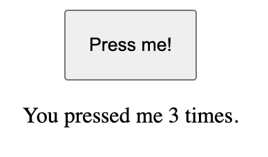
You click the button, and the counter increments.
The following example contains a few extra web component concepts, like lifecycle functions and observable attributes. You don’t need to understand everything going on in the code snippet. This example is really only used to illustrate how much boilerplate is required for the most basic of interactive interfaces, a counter button:
const templateEl = document.createElement("template");

templateEl.innerHTML = `
<button>Press me!</button>
<p>You pressed me 0 times.</p>
`;

export class OdysseyButton extends HTMLElement {
  constructor() {
    super();
    this.attachShadow({ mode: "open" });
    this.shadowRoot.appendChild(templateEl.content.cloneNode(true));
    this.button = this.shadowRoot.querySelector("button");
    this.p = this.shadowRoot.querySelector("p");
    this.setAttribute("count", "0");
  }

	// Note: Web components have lifecycle methods,
  // If we're setting event listeners when the component is added to the DOM, it's our job to clean
  // them up when it gets removed from the DOM
  connectedCallback() {
    this.button.addEventListener("click", this.handleClick);
  }

  disconnectedCallback() {
    this.button.removeEventListener("click", this.handleClick);
  }

  // Unlike frameworks like React, Web Components don't automatically rerender when a prop (or attribute)
  // changes. Instead, we need to explicitly define which attributes we want to observe.
  static observedAttributes = ["disabled", "count"];

  // When one of the above attributes change, this lifecycle method runs, and we can
  // react to the new attribute's value accordingly.
  attributeChangedCallback(name, _, newVal) {
    if (name === "count") {
      this.p.innerHTML = `You pressed me ${newVal} times.`;
    }
    if (name === "disabled") {
      this.button.disabled = true;
    }
  }

  // In HTML, attribute values are always strings. This means that it's our job to
  // convert types. You can see below that we're converting a string -> number, and then back to a string
  handleClick = () => {
    const counter = Number(this.getAttribute("count"));
    this.setAttribute("count", `${counter + 1}`);
  };
As web component authors, we need to consider a lot of things:
- Setting up the shadow DOM
- Setting up the HTML templates
- Cleaning up event listeners
- Defining properties that we want to observe
- Reacting to properties when they change
- Handling type conversions for attributes
And there are still so many other things to consider that I haven’t touched on in this article.
That isn’t to say that web components are bad and that you shouldn’t write them, in fact, I’d argue that you learn so much about the browser platform by building with them. However, I feel that there are better ways to write components if your priority is to write interoperable components in a much more streamlined and ergonomic way.
Writing web components with less boilerplate
As I mentioned earlier, there are a lot of tools out there to help make writing web components much easier. One such tool is called Lit, which is developed by a team at Google. Lit is a lightweight library designed to make writing web components simple, by removing the need for the boilerplate we’ve already seen above.
As we’ll see, Lit does a lot of heavy lifting under-the-hood to help cut down the total lines of code by nearly half! And because Lit is a wrapper around web components and other native browser features, all your existing knowledge about web components is transferable.
To start seeing how Lit simplifies your web components, here’s the hello world example from earlier, but refactored to use Lit instead of a vanilla web component:
import { LitElement, html } from "lit";

export class HelloWorld extends LitElement {
  render() {
    return html`<p>Hello World!</p>`;
  }
}`

customElements.define('hello-world', HelloWorld);
There’s a lot less boilerplate with the Lit component, and Lit handles the two problems I mentioned earlier, a little bit differently. Let’s see how:
- The markup is directly defined from within the component class. While you can define your templates outside of the class, it’s common practice to return the template from the
renderfunction. This is more in line with the mental model presented in other UI frameworks, where the UI is a function of the state. - Lit also doesn’t require developers to attach the shadow DOM, or create template and clone template elements. While having an understanding of the underlying web component features will help when developing Lit components, they’re not required for getting started, so the barrier for entry is much lower.
So now for the big finale, what does the counter component look like once we’ve migrated it over to Lit?
import { LitElement, html } from "lit";

export class OdysseyCounter extends LitElement {
  static properties = {
		// We define the component's properties as well as their type.
		// These properties will trigger the component to re-render when their values change.
		// While they're not the same, you can think of these "properties" as being
		// Lit's alternatives to "observed attributes"
		// If the value is passed down as an attribute, Lit converts the value
		// to the correct type
    count: { type: Number },
    disabled: { type: Boolean },
  };

  constructor() {
    super();
		// There's no need to create a shadow DOM, clone the template,
		// or store references to our DOM nodes.
    this.count = 0;
  }

  onCount() {
    this.count = this.count + 1;
  }

  render() {
		// Instead of using the attributeChangedCallback lifecycle, the
		// render function has access to all of the component's properties,
		// which simplifies the process of manipulating our templates.
    return html`
      <button ?disabled=${this.disabled} @click=${this.onCount}>
        Press me!
      </button>
      <p>You pressed me ${this.count} times.</p>
    `;
  }
}`
The amount of code we’re writing is cut down by almost half! And this difference becomes more noticeable when creating more complex user interfaces.
Why am I going on about Lit?
I’m a big believer in web components, but I recognise that the barrier of entry is high for many developers. Writing complex web components requires understanding heaps of browser features and the education around web components isn’t as comprehensive as other technologies, like React or Vue.
This is why I think it’s important to use tools like Lit can make writing performant and interoperable web components much easier. This is great if you want your components to work within any frontend framework.
If you’d like to learn even more, this is the approach I teach in my upcoming course Component Odyssey. This course is excellent for anyone who wants to understand how to write components that work in any framework. I do this by covering the absolute basics of web components, before moving on to tools like Lit that simplify the process of writing web components without complicating your development environment. By the end, you’ll learn how to build and publish a component library that works across any frontend framework.
If you want early-bird discount codes for Component Odyssey, then head on over to the site to get notified.
If you enjoyed this article, then I figure you like to be kept in the loop with web development tips. If so, the Component Odyssey newsletter might be right up your alley.