Exercise: Themes

Exercise 1: Building a theme toggler
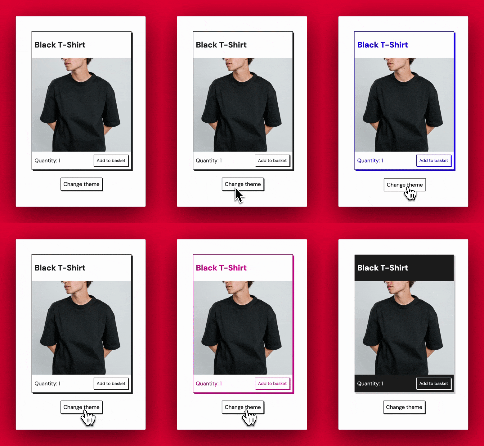
This is a course all about web components, so let’s go ahead and create a web component that’s designed to cycle through a variety of different themes. Here’s one in action:

Your first exercise is to build the above “theme-toggler” component.
All of the instructions are in the README, so just follow the usual steps.
Ultimately your goal is to use a button to cycle through 5 different themes, ‘red’, ‘blue’, purple’, ‘dark’, and ‘light’.
Try the exercise for yourself and get the test passing. If you get stuck, you can always peek at the “finished” code that you’ll find in the same repo.