Running an Accessibility Review for Your Checkbox
Building our own custom components comes with an extra, mostly unseen, set of responsibilities. As library authors, it’s our responsibility to ensure (to the best of our abilities) that our components are usable for all web users, regardless of whether they use a mouse, a keyboard, a touch device, or a screen reader to navigate the web.
The Odyssey Checkbox we’ve been building is an alternative to a control that already exists in the browser, namely the <input type="checkbox" /> element. The elements built into HTML often have excellent support for different input modes out of the box, even if they don’t look perfect.
When we build our own components from scratch, we run the risk of losing the accessibility benefits that come for free with native components. As a result, we need to review each component we build to ensure it doesn’t offer a degraded or unusable experience for our users. Everyone deserves a great web experience!
What is web accessibility?
To ensure that the components we ship are accessible, they need to be designed and developed so that people with different needs and requirements can use them. This includes people with visual and hearing impairments, people with reduced motor and cognitive faculties, and others.
Web accessibility is a broad and complicated space and I don’t feel qualified to teach how to build web experiences to accommodate people with dyslexia, autism, or other highly complex disabilities. No matter what you might hear online, there’s no quick, 1-line fix, to make your sites accessible for everyone.
With that said, I hope to provide some practical advice for each component that we build into our library so we can ensure they’re built on a strong foundation. We’ll do this through a very basic accessibility review.
Running our accessibility review
So what does an accessibility review look like?
We won’t perform an in-depth audit, we’ll just do a few standard checks to ensure we’re building on a strong foundation.
We’ll be testing the component in isolation, and we’ll cover the following things:
- Keyboard interactivity
- Click interactivity
- Focus visibility
- Associated form labels
- Reduced motion options
- Bonus: Screen reader compatibility
Testing our component
The way we’re going to test our component is simply by using it. We won’t just click it a couple of times and call it a day. Instead, we’ll test using a variety of input modes. We’ll compare it to a native input element to ensure that there’s parity between the basic functionality.
I’ll also link to the Web Content Accessibility Guidelines (WCAG), which details the criteria you need to follow to ensure that your web experiences are considered accessible. We don’t need to be familiar with the entire spec, just a few particular criteria for now.
If you want to follow along, you can run the dev server for your component and run through the testing steps along with me.
Since our checkbox component was built with accessibility in mind, you won’t need to make many changes. I’ll do a side-by-side of a badly written checkbox to show the consequences of an inaccessible checkbox.
Click interactivity
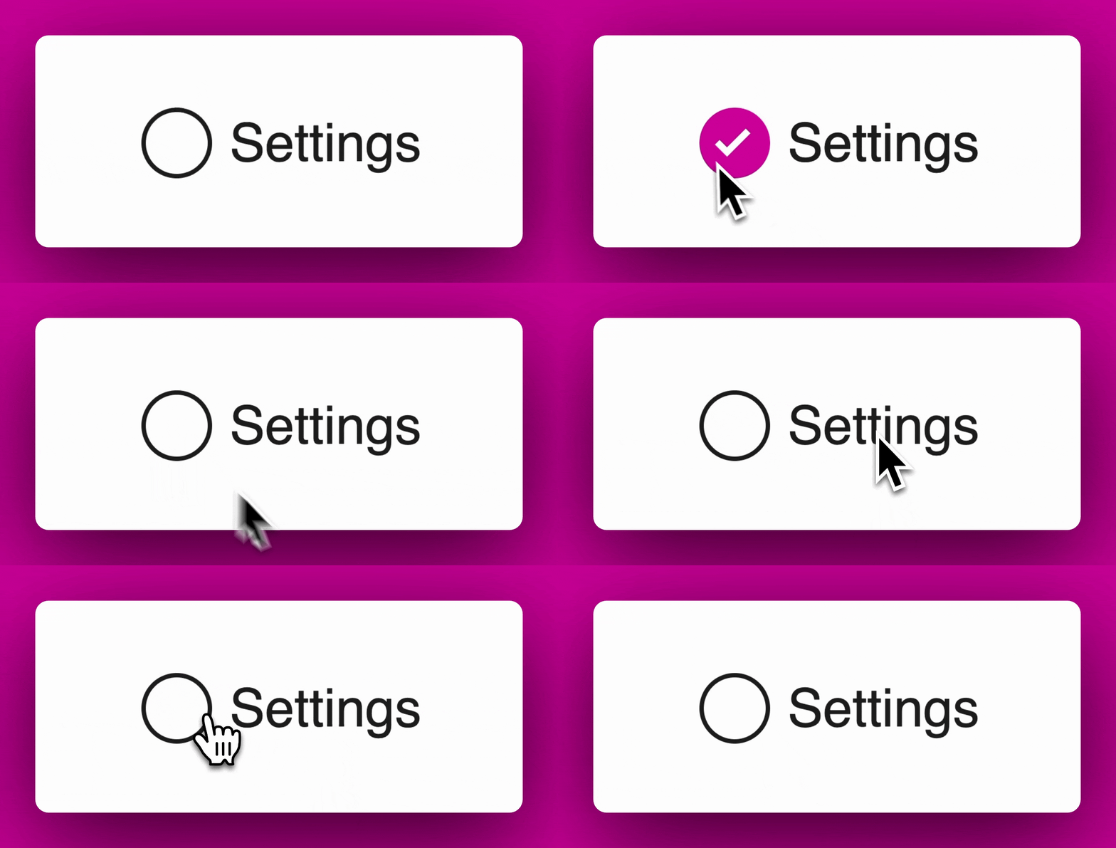
When we click it, it becomes checked. If we click it again, it becomes unchecked. If you repeat the same test on the native element, you see that it behaves the same way.
This is less an accessibility check, and more a “does this actually work” check. If it doesn’t work when you click, then you’ve got bigger problems.
With that said, you should also test your elements using a touch device. Creating an accessible experience for a mouse requires different considerations than for a thumb. For starters, a mouse is small and precise, a thumb is big and clumsy.
Once you’ve opened up your checkbox on your touch device, have a little play around with it. Do you find that you press the checkbox every time? If your checkbox is too small then you might find that some of your presses won’t register.
This is an accessibility issue as clickable elements should have a sufficient size.
There are a few ways to achieve this:
- Make the checkbox big enough so that it’s easily pressable using a touch device
- Associate the label with the form input, which in turn makes the label a target for checking and unchecking the element.
With a small clickable area
With a larger clickable area
Keyboard interactivity
By default, the browser recognises several different elements as interactive content, this includes elements like button, select, and input. As a result, the browser automatically adds those elements to the tab order. This means that you can navigate to it directly using the keyboard’s tab key. This is one of those out-of-the-box accessibility improvements that you get with using HTML elements.
So what level of keyboard interactivity does our checkbox need? The Web Accessibility Initiative (WAI) has a set of authoring guidelines for many different UI patterns including the checkbox, they specify that:
- A checkbox should be navigable using the
tabkey - A checkbox should be togglable using the
spacekey
Because the checkbox is a simple UI control, the keyboard requirements are straightforward. Some UI controls have very complicated keyboard requirements, which can make authoring components an unexpected challenge.
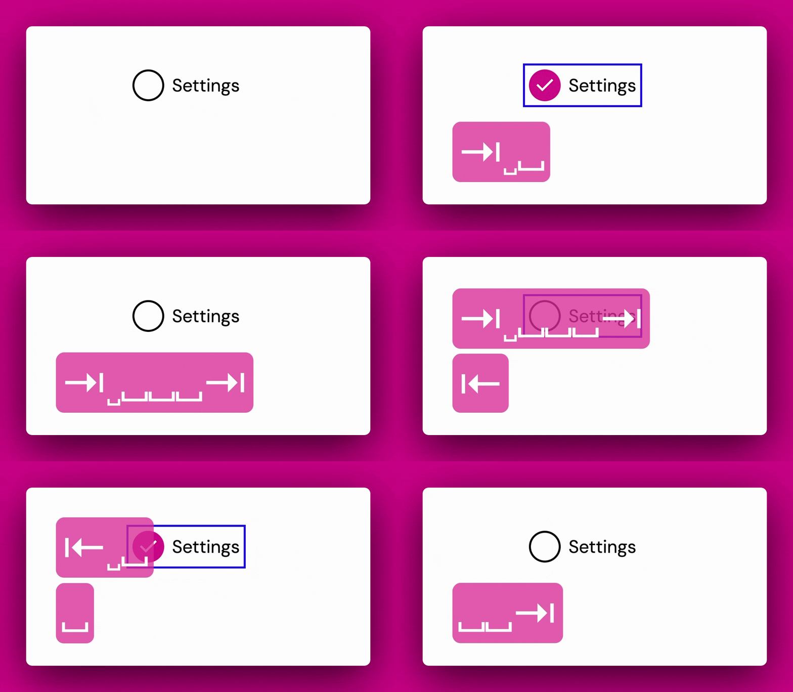
Go and tab to your component. You can see that the browser has focused on it, meaning that it’s ready to receive keyboard interactions. This also means that our checkbox is navigable using the tab key.
The next test is to press the spacebar a couple of times. When we do, we recognise that it checks and unchecks. This is a great start, as it means our component is compatible with both pointer devices + keyboard devices.
A quick detour: The importance of semantic HTML
Before we move on to the next test, it’s worth diving into why this behaviour worked out of the box. The browser doesn’t automatically add these behaviours just because our component is named “checkbox”.
First and foremost, we’ve used semantic HTML. We’ve built our checkbox using a combination of the input and label elements. If we were to have written everything using only the div element, the browser wouldn’t know how to add the interactivity. On the flip side, the browser does understand what kind of interactivity to add for elements like inputs and labels, which is why we get our tab and space behaviour for free.
While it would be possible to start with div elements and wire up all of the functionality ourselves, we can’t get away with simply adding click and keypress handlers to our component. This is because the div element doesn’t provide any other semantic information to the browser, we’d need to provide that additional information ourselves, usually in the form of ARIA tags, which provide more information to the Accessibility Object Model (AOM). And it doesn’t stop there either, web accessibility goes deep, and deviating away from the browser standards usually means one of two things happens:
- You provide a bad experience for your users, particularly your most vulnerable users
- You have to learn and implement a bunch of additional logic to ensure that you provide an accessible experience for your users.
Here’s a checkbox written using only divs. I’ve added a click handler, but that’s about it.
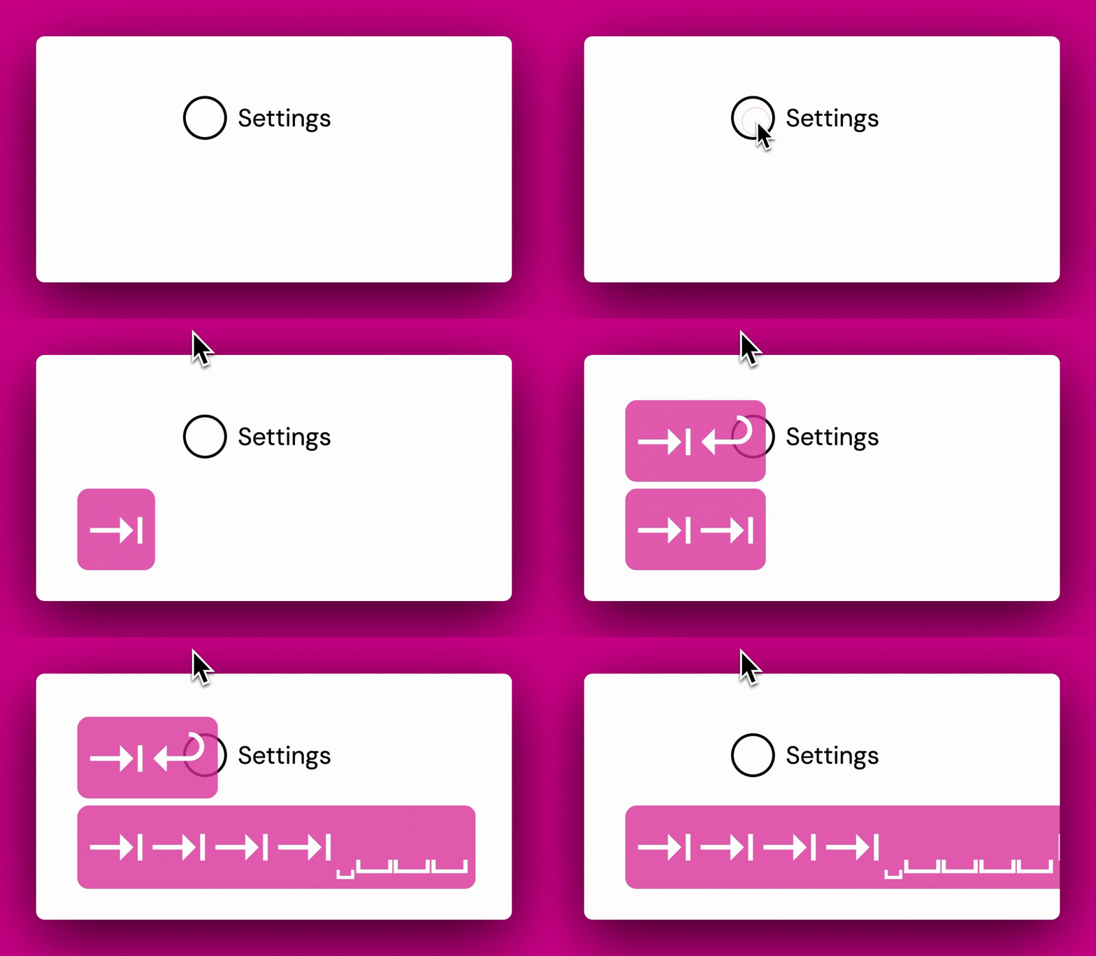
I can’t tab to it
I can’t interact with it using the keyboard
And screen readers will have no idea what the heck to do with it
Focus issues
One thing that you may have noticed is that the browser automatically applies a default outline style when we focus on our custom element. It doesn’t quite match our designs though. It’s possible to override these styles via CSS. You can (but certainly shouldn’t) remove the styles completely.
It’s best to leave the default browser styles. If you need to override them then ensure that whatever colour and thickness you use is clearly visible across across your site.
If you’ve spent a few days navigating the web using only the keyboard, it becomes very clear which sites care about their users, and which sites don’t.
Sites with great keyboard support often have a “skip links” button, which moves the browser’s focus to after all the navigation links, so you can easily get straight to the main content of the page. They’ll also have a clear focus indicator and no keyboard traps. A keyboard trap is a scenario where you’re unable to proceed using simply a keyboard.
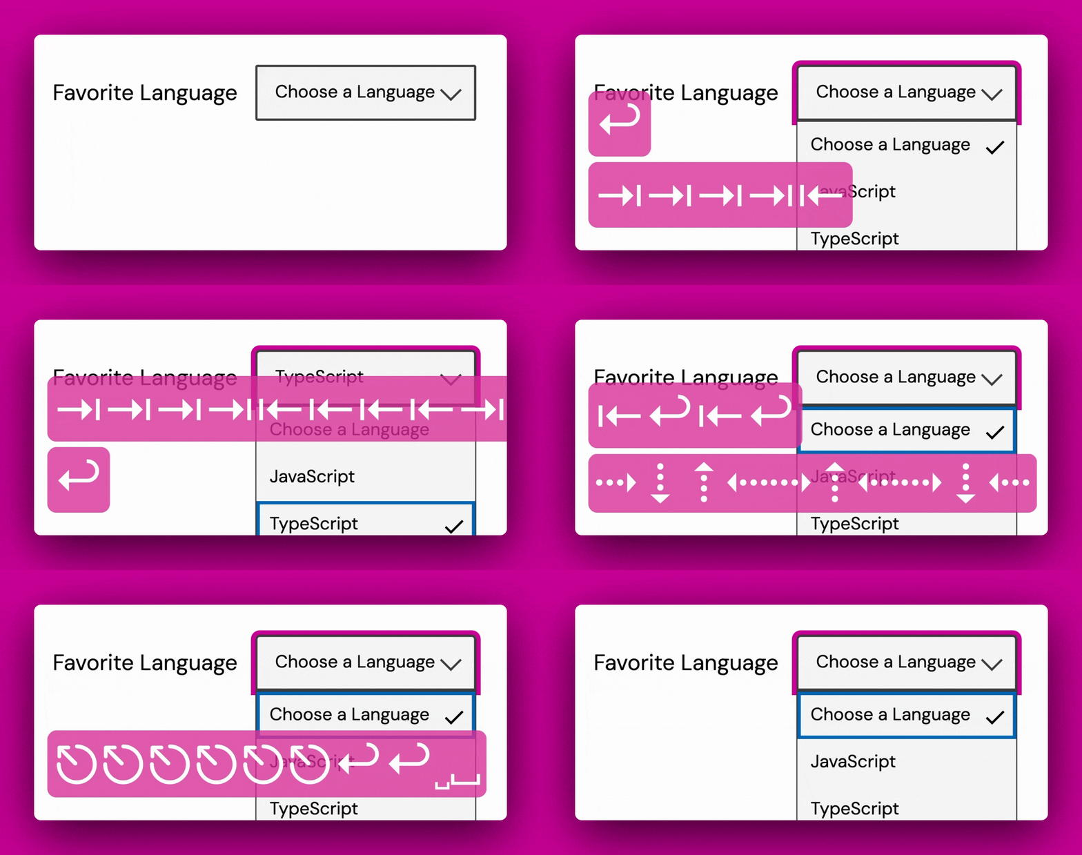
In the above example, I can select an item and navigate the form, but I can’t close the form without using the mouse. This is a keyboard trap.
Sites with poor keyboard support will often behave oppositely:
- Lots of unnecessary content to tab through on every page change
- Bad or non-existing focus visibility
- Keyboard traps, making it impossible to complete a required action using a keyboard alone.
Associated Labels
Back earlier, we improved the clickable area of our checkbox by associating the label with the checkbox. It might seem small, but this is a really important accessibility win. It’s also incredibly easy to implement, here’s all the markup you’ll need to achieve this:
<input id="text-input" /> <label for="text-input">First Name</label>You need three things:
- An
inputand alabelelement - The
inputneeds a unique ID - The
labelneeds aforattribute with a value of theinput’s ID.
This is such a quick win, that there’s almost no excuse for implementing such a thing when authoring any sort of markup for the web.
Here are just two of the reasons why it’s important having associated labels:
- Associating a label provides additional context for screen readers, otherwise there’s no way for screen readers to know what input a label is associated with.
- Associating a label improves the clickable area of our input. Especially useful for users on touchable devices, where fingers are thicker and clumsier than a mouse.
There are also other ways to associate some extra context for screen readers, there are elements like fieldset which can be used to group many controls. Another is the aria-describedby attribute which is used to associate a description with an element.
Reduced motion controls
Developers love to build really fun and swanky designs. I follow heaps of developers on Twitter who create some mind-blowing user interfaces, often using little more than CSS. These impressive looking interfaces often include lots of cool transitions and animations.
While it’s a lot of fun to create cool (and sometimes chaotic) animations, you should also offer the option for users to turn off those animations if they need to.
Motion animation triggered by interaction can be disabled, unless the animation is essential to the functionality or the information being conveyed.
That isn’t to say that you shouldn’t have animations to make your components look and feel awesome, but offer a way to turn them off for users who find excessive motion harmful, uncomfortable, or distracting.
This isn’t a difficult thing to implement, especially as CSS offers a media query that only runs if the user has set their system preferences to “prefers reduced motion”.
The below is our checkbox but with a few extra animation flourishes. It was heavily inspired by the example in the following CodePen
Without “prefers-reduced-motion”
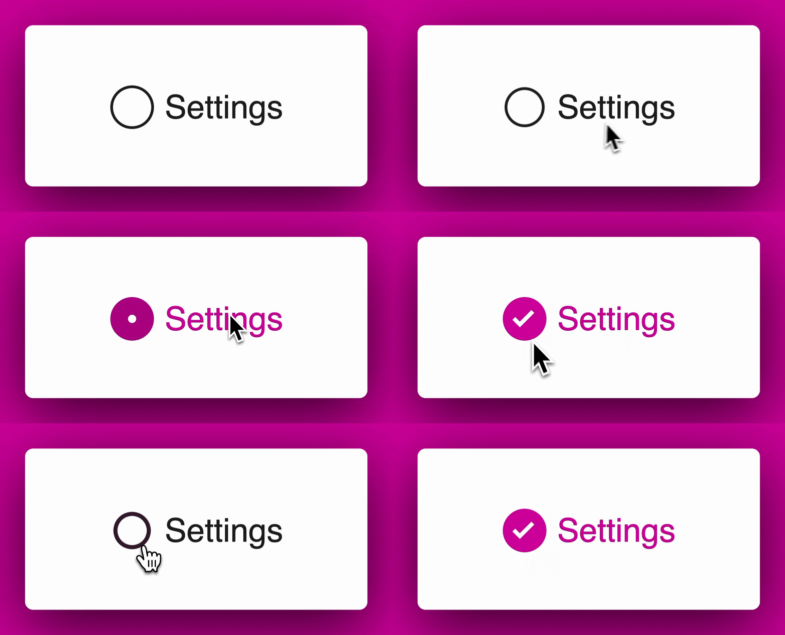
With “prefers-reduced-motion”
Using a screen reader
I’ve spoken a little bit about screen readers, but haven’t really explained what they are. At its most simple, a screen reader is a tool that’s often used by those hard of sight to navigate the web. It works by reading out the contents of the screen.
In the lesson video, I show how a screen reader behaves when using the Component Odyssey website.
In the image, the bottom left shows how the screen reader interprets the content of the web page. A well-formed web page will help a screen reader accurately understand what’s going on in the page, while a badly written web page will just spout out nonsense.
Here’s what a screen reader reads out when it hits our checkbox:
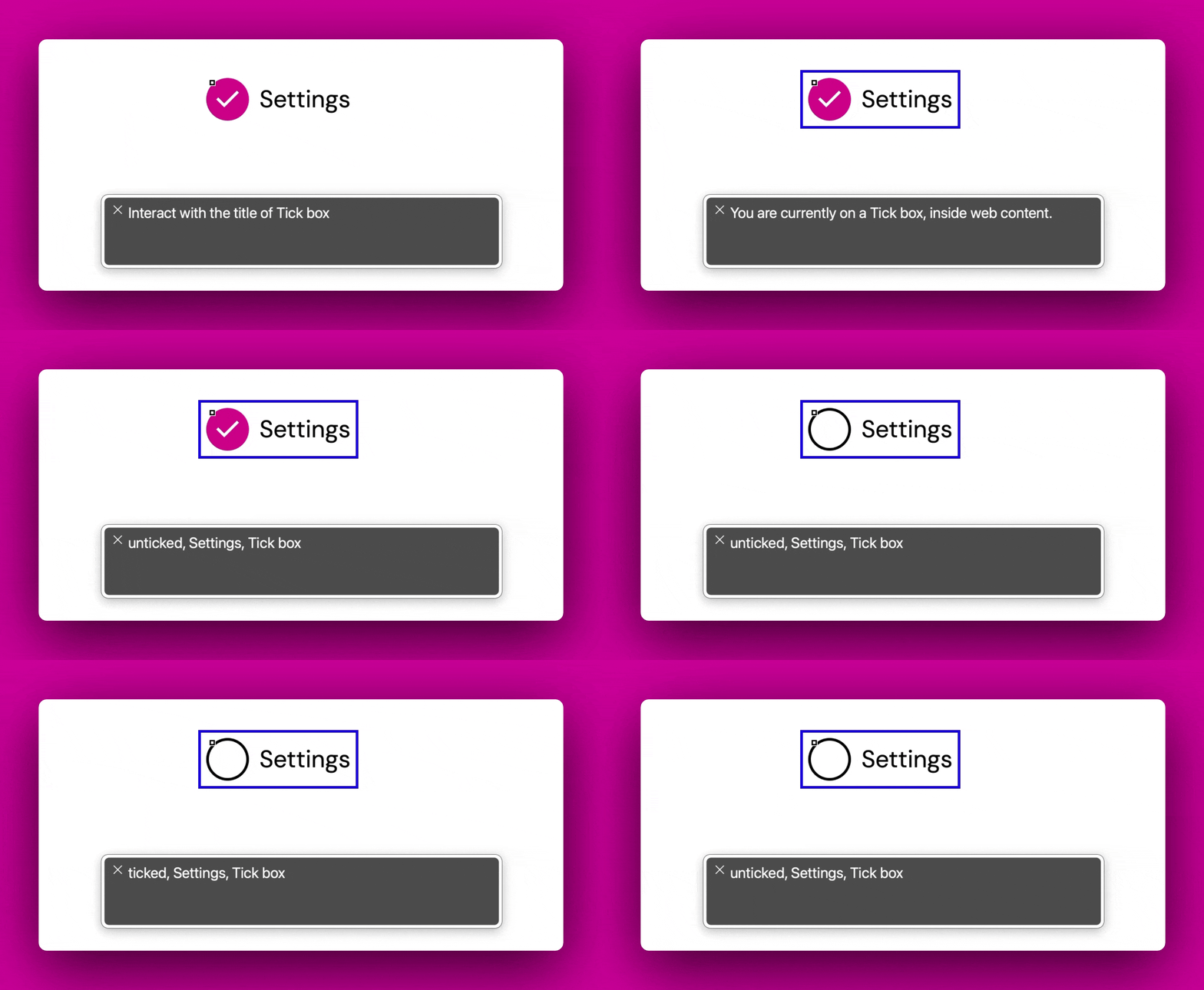
You can see that the does a few things. When we focus on the checkbox via the screen reader, the screen reader announces the state of the checkbox, the label, and then the control type. When we check it, you can see that the screen reader announces the same information but with the updated state.
Using a screen reader has a learning curve, but it can be really illuminating to see what issues your components have for non-sighted users.
Wrapping up
This was a very brief introduction to the world of accessibility. I hope this lesson has given you a better mindset for building accessible components.
I’ve added in some resources below, but there are so many more I could have put in here. If you’re interested in learning more then just have a read through these resources. If you’ve also found some good resources on accessibility then please share them with the rest of the Discord group.
Resources
Web Accessibility - An amazing free course that introduces the basics of web accessibility. I’d massively recommend it as a practical introduction to the practice
ARIA Authoring Practices Guide