The Two Lines of CSS That Tanked Performance (120fps to 40fps)
First published: 22/08/2024
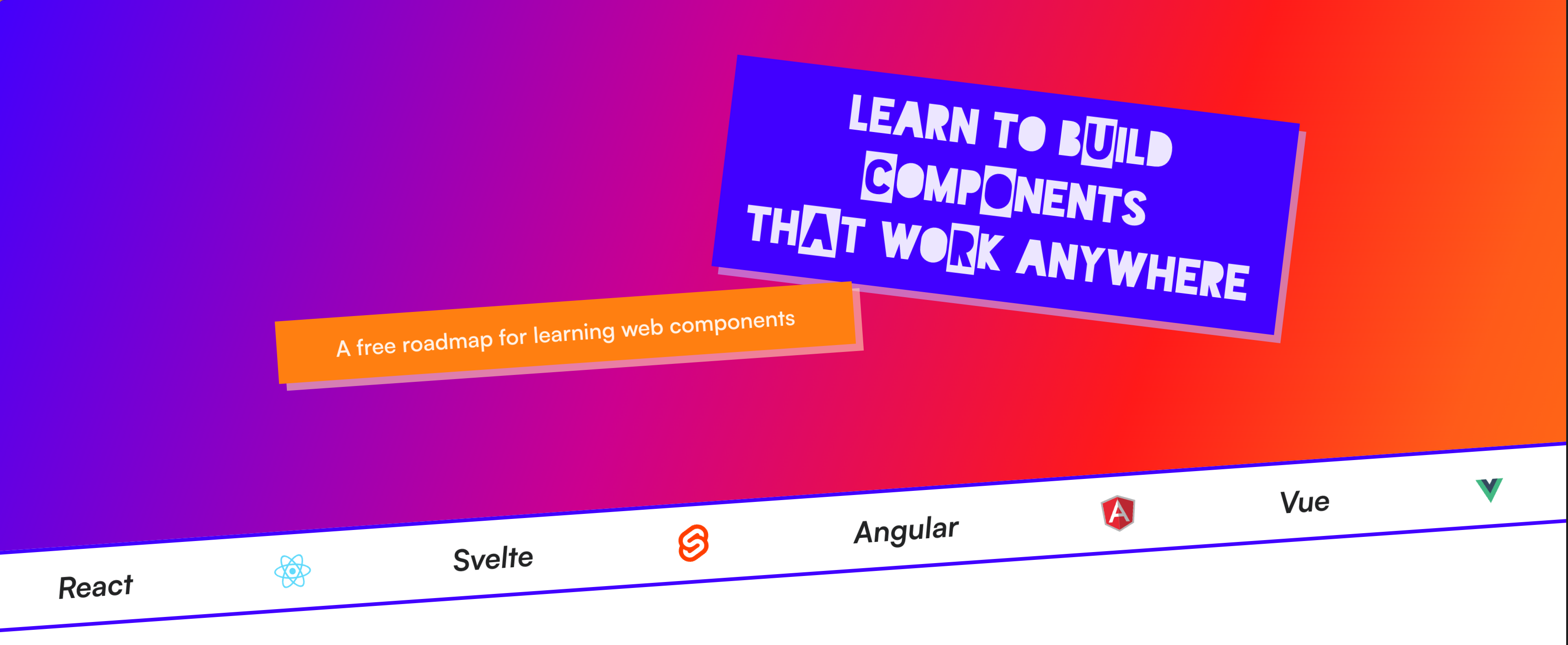
I recently released Learn WCs. If you’ve seen it, you’ve likely noticed the animation in the background, where the coloured circles move diagonally across the screen. It looks like this:
It works nicely on Chrome and Safari, but I noticed a severe drop in performance on Firefox.
You might not be able to see it much in the video, but the FPS drops signficially. As a user, you can really feel this drop in performance. It was so bad, that I straight up disabled this animation in Firefox.
How does the animation work?
The animation is built using two divs. The outer div is the first child of body element.
<body>
	<div class="background-mask">
		<div class="background-gradient"></div>
	</div>

	<!-- Rest of content -->
</body>
The .background-gradient element is responsible for creating a gradient that spans the entire width and height of its parent container. Like so:
The outer .background-mask is responsible for two things:
- Setting the position to
fixedto make the container fill the entire dimensions of the viewport. - Creating a dotted mask over the gradient
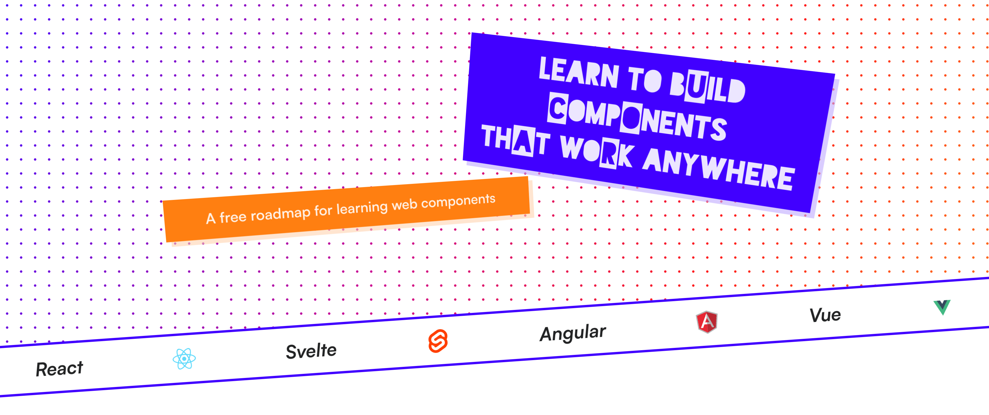
The latter steps ensures the colour of the dots is the colour of the gradient directly underneath it:
Finally, I’m animating the mask by adjusting its position over time. It repeats indefinitely, giving it that cool diagonally flowing motion.
Here’s the CSS for everything I described above:
.background-mask {
	--mask-size: 24px;

	/* Position Styles */
	position: fixed;
	width: 100%;
	height: 100%;
	z-index: -1;

	/* Mask Styles */
	mask-image: radial-gradient(black 2px, transparent 2px);
	mask-size: var(--mask-size) var(--mask-size);
	mask-position: 0px 0px;
	animation: mask-move 3s infinite linear;
}

.background-gradient {
	background: var(--red);
	background-image: var(--gradient);
	width: 100%;
	height: 100%;
}

@keyframes mask-move {
	0% {
		mask-position: 0px 0px;
	}

	100% {
		mask-position: var(--mask-size) var(--mask-size);
	}
}

@media (prefers-reduced-motion: reduce) {
	.hero-background-mask {
		animation: none;
	}
}What’s causing this drop in performance?
Not all CSS properties animate equally. Without going too much into how the browser renders HTML to the page (though I’ve outlined it here), there are a handful of stages it goes through. The three stages that we’re interested in are:
- Layout - When the browser calculates the size and positions of the elements on the page
- Paint - When the browser draws all the visual aspects of the page, like images, colors, shadows, etc
- Composite - When the browser layers the elements on top of one another in the correct order
The order of the pipeline looks like this:
Layout → Paint → Composite
The layout and paint processes can be CPU-intensive, so it’s important to try and reduce the amount of times your CSS triggers the stages in the pipeline. The browser helps in some part by optimising performance for certain properties, some skip entire stages of the rendering pipeline and others can leverage hardware acceleration to move computation from the CPU to the GPU.
Animating certain properties, like translate and opacity , can avoid triggering a layout and use hardware acceleration.
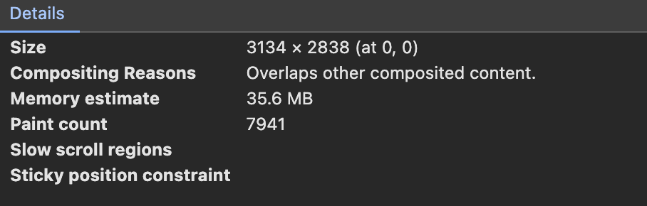
Sadly, this is not the case when animating mask-position. I took a look at Chrome and saw that the paint count for the background div was increasing on every frame. After a few seconds it had already triggered a paint over 1,000 times.
Even with this high paint count, the animation on Chrome felt smooth. However, it felt super janky on Firefox. Annoyingly, I couldn‘t find a way to measure the paint count on Firefox, so any assumptions I make about Firefox’s poor performance is purely conjecture.
I did noticed that the performance is fine for small devices, but gets worse as the size of the screen increases. My working theory is that Firefox doesn’t batch the layout triggers for each of the 24x24 masks, causing the FPS to tank when more masks are present. Again, I might be completely wrong here.
How did I fix this?
Instead of animating badly optimised CSS properties like mask-position , I needed to lean on the more performant properties, like translate.
The solution wasn’t to move the masks by 24px, but to instead move the entire background element using the translate property.
From an abstract standpoint, this is how the animation works:
Here’s the two line change in the CSS:
/* --mask-size = 24px */
@keyframes mask-move {
0% {
transform: translate(calc(var(--mask-size) * -1), calc(var(--mask-size) * -1));
}
100% {
transform: translate(0px, 0px);
}
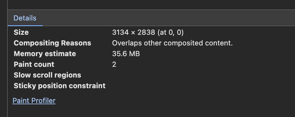
}The browser no longer animates the mask-position, which triggered a layout on each frame. Even though the background moves on each frame, translate doesn’t trigger a layout or a paint. You can see that the background div only paints twice, down from 1,000+ every minute.
Eagle-eyed viewers will have spotted a problem. If you remember, the height and width of the background fills the viewport. Shifting the background left and up by 24px leaves us with this empty space in the viewport.
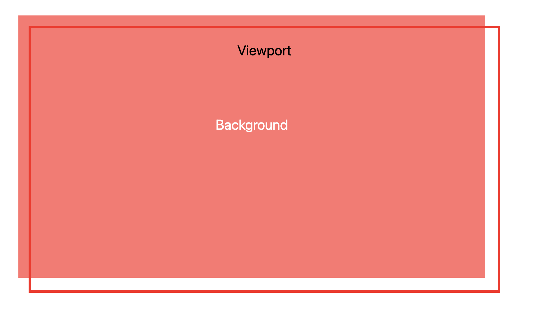
Solving it is as simple as adding the mask size to the width and height of the container:
.background-mask {
	--mask-size: 24px;

	width: calc(100% + var(--mask-size));
	height: calc(100% + var(--mask-size));
}
Let’s take a look again in Firefox:
It may not be a perfect solution, but it’s always a little satisfying pulling off a fun smoke and mirrors CSS trick.
If you enjoyed this article, then I figure you like to be kept in the loop with web development tips. If so, the Component Odyssey newsletter might be right up your alley.