masonry-gallery Web Component
First published: 08/08/2024
A few years back I created an image gallery inside a React project. The images had inconsistent widths and heights, and so it made sense to display it as a masonry layout.
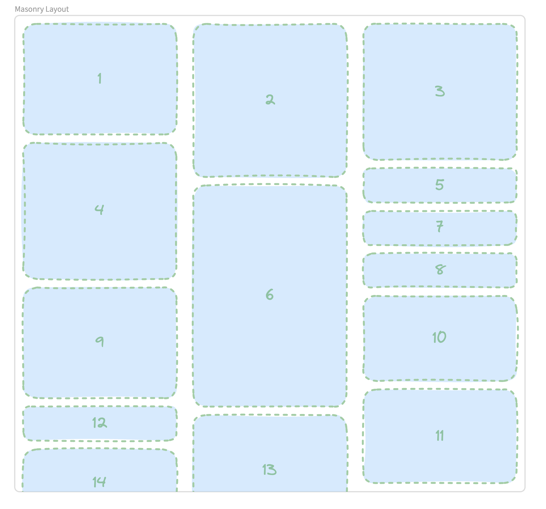
For those not familiar, a masonry layout is a way of displaying content (usually images), where each image is appended to the currently shortest column, like so:

The numbers in the box, indicates the order in they’re appended to the layout. There’s currently no masonry layout implemented across the browsers, though the specs are currently being defined.
As for creating a component, it was such a waste for the OG being locked in React-land. Especially as I have no plans to revisit that project.
It made a lot more sense to create a web component that renders a masonry layout. For starters:
- Should the component fail to load/register, the user still sees the default browser behaviour
- It wouldn’t rely on a specific JavaScript framework.
- There’s no complex logic going on, so it would be a lean component with little overhead.
- There’s no need for style encapsulation, so
masonry-galleryavoids using the Shadow DOM
In fact, masonry-gallery is only 4kb unzipped and has zero dependencies. The component doesn’t use the shadow DOM either, so you can style it to your heart’s content using your global CSS.
Here’s the component in action:


Getting started
To use this layout in your project, run the following:
npm install masonry-galleryUsage in HTML
You can then import the module inside of your HTML:
<body>
	<masonry-gallery>
		<img src="https://placedog.net/600/400" />
		<img src="https://placedog.net/220/450" />
	</masonry-gallery>

	<script type="module" src="node_modules/masonry-gallery/masonry-gallery.js"></script>
</body>
Usage in JavaScript
import 'masonry-gallery/masonry-gallery.js';You’ll need to ensure that the above JS file is imported within your webpage.
Learn More
Jump over to the GitHub if you want to learn more or see the code itself.
If you enjoyed this article, then I figure you like to be kept in the loop with web development tips. If so, the Component Odyssey newsletter might be right up your alley.