Using Heaps of Cutting Edge CSS Features to Build a Progress Indicator
First published: 05/01/2024
For the last 7 months, I’ve had my head down building Component Odyssey. It’s been a richly fulfilling project and I’m eager for people to take the course and learn heaps about building component libraries using web components.
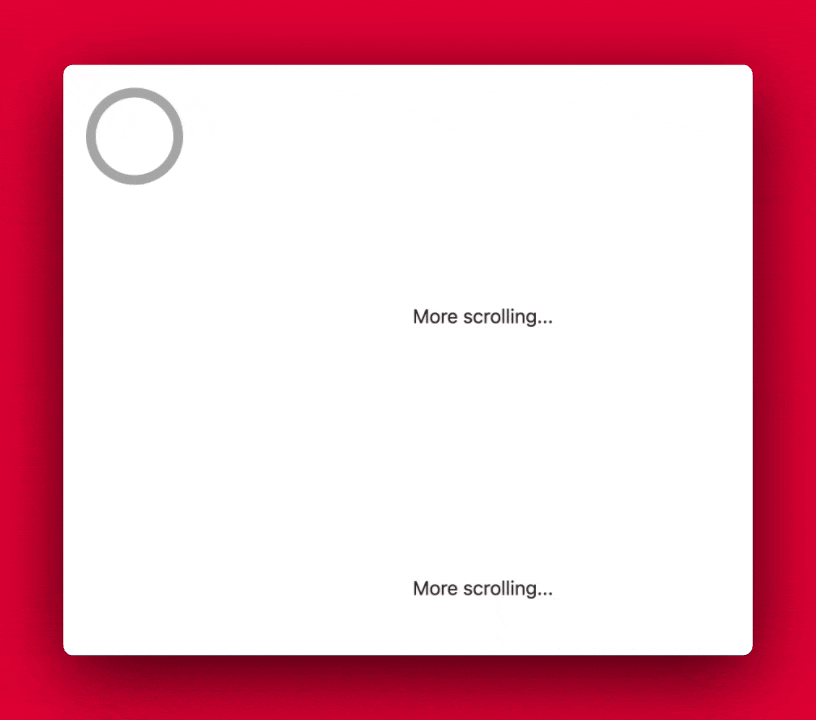
I’ve seen some incredible demos over the past year and wanted to bite my teeth into some of these cool new features. So I used some downtime over the Christmas period to cram tons of new CSS features into a lesson progress indicator for the Component Odyssey platform. The result is the following progress indicator that shows how much of the page the user has scrolled:

Building it gave me some exposure to some of the latest CSS features like:
animation-timeline: scroll()- CSS trig functions,
sin()andcos() color-mix()- the
@propertyat-rule
I know the risks of building something with a particular tool in mind. As the saying goes “When all you have is a hammer, then something something nails”
Yes, I have a hammer, and I’m going to smash the walls down with it.
In this article, I’ll run through how to create a pared-down version of this swanky progress animation while still using all of the CSS features mentioned above. I’ll also show you how to gracefully handle browsers that don’t support these features through progressive enhancement.
If you want to follow along, then it’s best to use the latest versions of Chrome or Safari, currently Firefox doesn’t have general support for properties like animation-timeline. Get started by jumping into the starter Codepen.
If you want to peruse the finished code, you can check it out here.
Creating the markup
I’ve already provided a little markup to simulate a page with enough content that you need to scroll to get to the bottom. To get started creating the progress indicator, you’ll need to add some more markup.
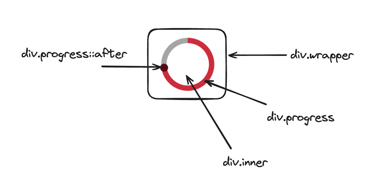
The markup itself is really simple, we’ll only need to create 3 div elements.
The outer element is responsible for the positioning and layout of the loader. We’ll give this a class of wrapper.
The middle element is responsible for rendering the track to the screen. We’ll give this element a class of progress. We’ll later use a ::after pseudo-element to create the thumb.
The innermost element will be used to create the circular hole in the middle, making the indicator look like a low-calorie doughnut. This will have a class of inner.
Take a look at the following if you need a hand visualising the structure:
Provide the following markup as the first child of the main element create the following markup:
<div class="wrapper">
	<div class="progress">
		<div class="inner"></div>
	</div>
</div>
You’ll also need to apply the following styles to give the markup a base visual experience:
.wrapper {
	--size: 80px;

	position: fixed;
	width: var(--size);
	aspect-ratio: 1/1;
	top: 24px;
	left: 24px;
	display: flex;
	align-items: center;
	justify-content: center;
}

.progress {
	--track-size: 16px;

	width: var(--size);
	aspect-ratio: 1/1;
	border-radius: 50%;
}

.inner {
	position: absolute;
	width: calc(100% - var(--track-size));
	aspect-ratio: 1/1;
	background: var(--background-color);
	border-radius: 50%;
	top: 0;
	left: 0;
	right: 0;
	bottom: 0;
	margin: auto;
}
Most of the CSS here shouldn’t come as a shock to you, so I won’t go over it line by line, but I will touch on some of the more interesting bits.
In .wrapper we’re fixing the element to the top left of the screen, and using flexbox to center the children horizontally and vertically.
As for the .inner element, I’ve used a mix of absolute positioning and the margin: auto to center it in the middle of the .progress element. We’ve also deducted the --track-size from the full width of the container, to ensure that it’s correctly positioned over the .progress element.
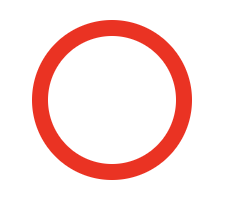
You won’t be able to see anything just yet, but if you add a temporary background-color: red to the .progress element, it should render as follows:
Creating an animated progress indicator
Creating a scroll-driven animation of this kind requires a lot of new CSS features that you may have not used before. Instead of learning everything all at once, we’ll start by decoupling the animation from the scrolling mechanics.
That way, by the end of this section, you should have the following animation that plays automatically:

We’ll start by creating a new animation called load:
@keyframes load {
	0% {
		--progress: 0%;
	}

	100% {
		--progress: 100%;
	}
}
All this does is move the progress along from 0 to 100 over the course of the animation. In your .progress rule, add the following CSS properties:
.progress {
	# Existing rules

	animation: load linear 1s infinite;
	background: conic-gradient(
		from 0deg at 50% 50%,
		var(--red) var(--progress),
		var(--black) var(--progress)
	)
}
The animation property should be pretty straightforward, but there’s a lot going on with the background rule, so let’s step through it.
For starters, we’re using a conic-gradient as it makes it easy for us to animate the background over 360 degrees, in the way shown in the animation above. We’re starting from the 0deg position, which is top and center. We’re describing where we want the center of the gradient to be using at 50% 50%.
conic-gradient(from 0deg at 50% 50%) alone would render something like the following:
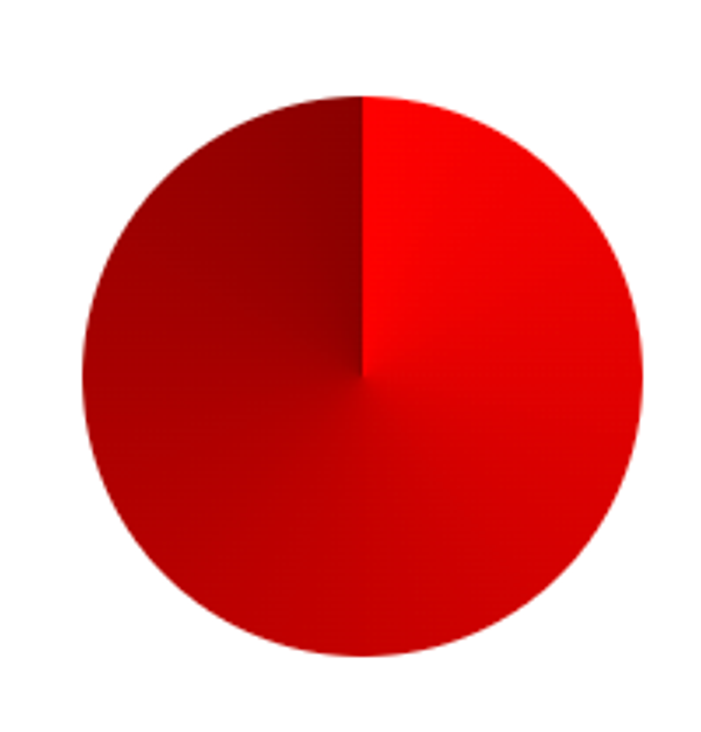
Hopefully I’ve made it clear why that’s the case.
As for the the second and third arguments of the conic-gradient function, we’re linking the --progress variable (which is being calculated via the load animation) to the two colors. The --red is used to denote the completed progress, while the --black is used to denote the remaining position. It might be confusing why they share the same --progress value. The --progress value for the --red value denotes where the gradient stop ends, while the --progress value for the --black denotes where the gradient stop begins. Because it’s the last stop on the gradient, it’s implied that it ends at 100%. By setting the same --progress value to both stops in the gradient, we create a hard transition between the two colors. Without doing so, our progress indicator (with a --progress value set to 16%) would look like this:
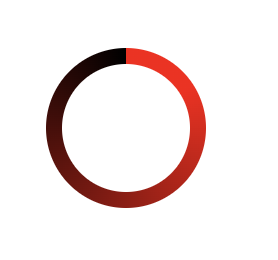
Now, something strange is probably happening. Instead of your progress indicator transitioning gracefully across the entire perimeter of the circle, it’s instead flashing between the black and red.
Why is this happening?
This is because we’re making the browser interpolate between percentage values, which is something it can’t do automatically. Even though we’ve given the --progress variable a percentage value, the browser doesn’t assume that it’s always going to be a percentage value.
We can solve this by telling the browser that --progress will always be a percentage value. We can do this by explicitly defining the --progress property using the @property CSS rule. Just add the following to the top-level of your CSS:
@property --progress {
	syntax: '<percentage>';
	inherits: false;
	initial-value: 0%;
}
We’re telling the browser that --progress should only support percentage values and that the initial value is 0%. We’re also not interested in having the custom element inherit its value.
Finally, I don’t quite like the use of the --black variable to signify empty progress. It looks too stark. I’d like to create a lighter shade created from the black to ensure a more homogenous visual palette. This is something we can easily achieve using the color-mix() CSS function.
Jump back up to the :root CSS rule and add the following variable:
:root {
	# your other CSS variables

	--grey: color-mix(in srgb, var(--black), transparent 60%);
}
The color-mix function lets us mix two colors together. In this case, we’re mixing the color stored in our black variable with some transparency, which will result in a partially see-through grey color. You’ll need to replace the reference to the --black variable in the conic-gradient function with --grey to see the color change in effect.
Now that we’ve defined our custom property, the browser will be able to interpolate the correct values during the entire animation, so it should now transition smoothly from start to finish.
Scroll driven animations
The next stage of our animation journey is to tie our animation to the scrolling of the page.
This should only take us a couple of lines of CSS.
You’ll need to do two things. First adjust the animation property in your .progress class to remove the infinite value, and to change the duration from 1s to 1ms. We can’t remove the value altogether because Firefox needs it for scroll animations to work.
Next update your .progress class to include the following
.progress {
  # other CSS properties

	animation-timeline: scroll(nearest block);
}
The animation-timeline property tells the browser to tie the progress of the animation with a specific timeline. In this case it’s the scroll timeline, which we specify using the scroll function.
You can see I’m providing two arguments to scroll(), nearest and block.
The nearest value is used to tie the animation to the nearest ancestor that has a scrollbar, in this case it’s the document. If you’re certain that you only ever want to tie the animation to the document’s scrollbar, then you can use swap out nearest for root instead.
The block property denotes the axis that we want to tie our animation to. For most cases this will be the vertical scrollbar, but for vertical writing modes, this will be the horizontal scrollbar.
Now that you’ve hooked up the animation to your page’s scroll, you should be able to scroll up and down the page and watch how your animation changes accordingly.
Progressively enhancing your scroll animation
While it’s exciting to use these new features in the browser, the animation-timeline property doesn’t have universal support across browsers yet. It’s still very new in Chrome, and it’s only available in Firefox behind a feature flag. If you try opening the code in Firefox, you’ll notice that the progress ring just appears with a finished animation.
In cases like this, it’s important to set up a solid base experience for all browsers, and then progressively enhance your webpage with the newer features on compatible browsers. Because the progress indicator isn’t critical for the application to function, we can just hide it away if the browser doesn’t support the animation-timeline property.
We can do this by moving our .wrapper, .progress, and .inner classes within CSS’s @supports at-rule, like so:
@supports (animation-timeline: scroll()) {
	.wrapper {
	}

	.progress {
	}

	.inner {
	}
}
Doing so ensures that if the browser doesn’t support scroll(), then it will ignore all of the styles contained within the rule.
Adding the indicator thumb
The final thing for us to add is a cool little indicator thumb, to both give our progress indicator a little more visual interest and to also let us play with the swanky CSS trigonometric functions.
To create the indicator thumb, start by writing the following CSS inside of the @supports block:
.progress::after {
	--radius: calc(var(--size) / 2);
	--track-offset: calc(var(--track-size) / 4);

	content: '';
	position: absolute;
	aspect-ratio: 1/1;
	width: calc(var(--track-size) / 2);
	background: var(--red-dark);
	border-radius: 50%;
	left: calc(50% - var(--track-offset));
	top: calc(50% - var(--track-offset));
	transform: scale(1.5);
}
This creates a new pseudo-element off of the .progress class, and gives it it’s visual appearance. Once added, the indicator thumb should live in the center progress element. We’re using the --track-offset variable to position the thumb correctly by taking into consideration the dimensions of the track.
The next step is to use the color-mix() function again to create a dark red from the base red color. Add the following to your :root rule.
:root {
# your other CSS variables
--red-dark: color-mix(in srgb, var(--red), var(--black) 60%);
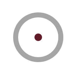
}Your progress indicator should look less like a UI widget and more like a dartboard:
Let’s position the thumb on to the track.
.progress::before {
  # rest of properties

	translate: calc((var(--radius) - var(--track-offset)) * cos(var(--angle)))
      calc((var(--radius) - var(--track-offset)) * sin(var(--angle)));
}
This is probably the gnarliest piece of CSS in this entire article. It isn’t anywhere near as complex if we break it down in half. Here’s the first half:
calc((var(--radius) - var(--track-offset)) * cos(var(--angle)))This uses a little trigonometry to calculate the position of the thumb based on the current angle (which will be tied to the scroll progress) and the radius of the circle. The cos() function is used to determine the horizontal value of the position.
The second half of the value is identical, except we’re using the sin() function to determine the vertical position of the indicator:
calc((var(--radius) - var(--track-offset)) * sin(var(--angle)))You may have noticed that I’ve specified a variable, --angle that I haven’t yet defined. Because we’ll be animating the --angle we need to explicitly define it using the @property rule, much like we did for the --progress property. The only difference is that we’ll need to specify a different syntax value. Instead of <percentage> the value will need to be <angle> .
@property --angle {
syntax: '<angle>';
inherits: false;
initial-value: -90deg;
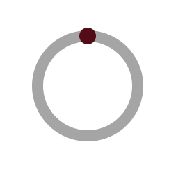
}By setting the initial value to -90deg we ensure that thumb is placed at the 12 o’clock position on the progress indicator.
Your indicator should now look like this:
The next step is to create the animation for the thumb and then bind the animation timeline to the scroll position of the page.
Let’s start by creating a new animation:
@keyframes rotate {
	0% {
		--angle: -90deg;
	}

	100% {
		--angle: 270deg;
	}
}
Over the course of the entire animation, the thumb will rotate 360 degrees, performing a full revolution over the progress element.
Finally we need to add the following two properties to the thumb:
.progress::after {
	# other CSS properties

	animation: rotate linear 1ms;
	animation-timeline: scroll(nearest block);
}
Doing so applies the rotate animation to our thumb and binds it to the scroll position.
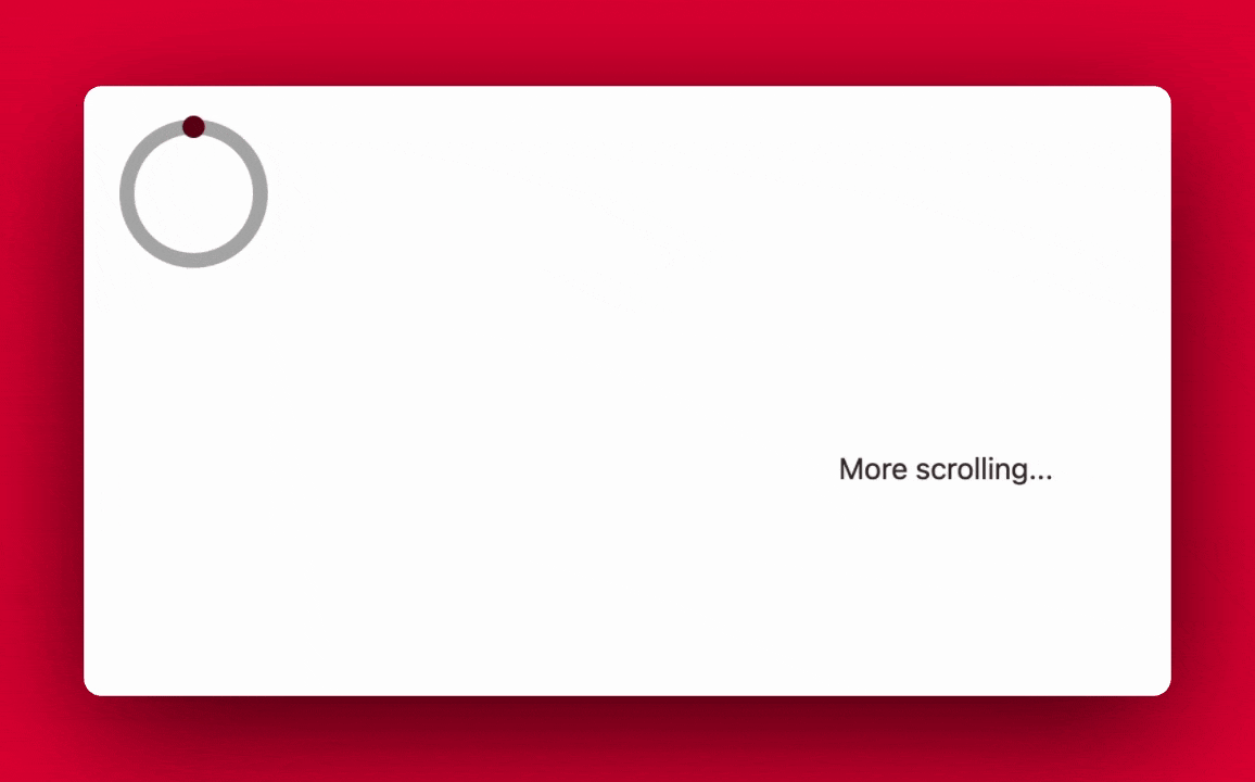
Everything should now work flawlessly:
Wrapping up
I created this progress indicator specifically to become more familiar with the amazing tools that CSS has shipped in the last couple years. Hopefully you learnt just as much from this lesson as I did making it.
There were other CSS features I wanted to explore, like popover and :has but I couldn’t find a way to fit them in with this animation. If people find this article interesting, I might try and create more little changes to the Component Odyssey platform, using cutting-edge CSS features.
By wary, that because a lot of the CSS features I’ve covered are still very new, check the browser support before using them in production. If they’re not supported in one or more browsers, but you’re desperate to use them, then use a progressive enhancement strategy to ensure that those with compatible browsers get the full experience, while still offering users of unsupported browsers a solid baseline experience.
Resources
Getting practical with scroll progress timelines
If you enjoyed this article, then I figure you like to be kept in the loop with web development tips. If so, the Component Odyssey newsletter might be right up your alley.