autosize-textarea Web Component
First published: 04/12/2023
At work, I was tasked with creating a text input that grew vertically to match the internal content.
I was hoping there was a handy HTML attribute I could apply that would magically solve the problem for me.
Spoilers: There wasn’t
After having a quick Google, it was apparent that I needed to tap into some JS to get this working.
The two existing solutions that stuck with me were the following
I was tempted to drop in Jack’s library, but I didn’t like the idea of having the state of all the textareas managed by a singleton. I’d prefer to instead create and manage an instance per textarea. I wanted to supplement the existing behaviour of the textarea, and so a little web component felt like the best solution for this problem.
This is what it looks like in action:
<autosize-textarea>
	<textarea placeholder="Type something here..."></textarea>
</autosize-textarea>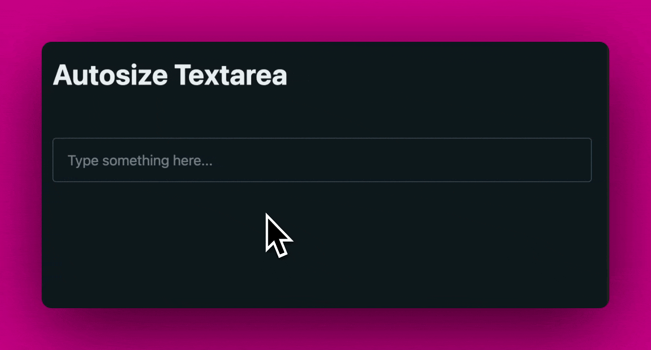
You start with your textarea element, and give it whatever attributes you want. You then wrap it with the autosize-textarea which gives it the additional autosize functionality.
For the implementation, I decided to omit the shadow DOM for a few reasons:
- I wanted easy access to the
textareaelement, so I can adjust the styles and attributes. - I wanted the
textareato be part of the light DOM, so that it inherits the document’s styles, and the user can apply the standard HTML attributes to it.
The autosize-textarea also progressively enhances the standard textarea. If something goes wrong with the loading of the web component, then the textarea will still render and function as expected.
In other words, we start with a standard textarea, and progressively enhance to use the autosize textarea when the JS loads and the component is registered.
Very handy!
If you enjoyed this article, then I figure you like to be kept in the loop with web development tips. If so, the Component Odyssey newsletter might be right up your alley.