Refactoring a scroll-driven animation from JavaScript to CSS
First published: 10/06/2024
Scroll-linked animations are all the rage in the frontend space right now, in no part due to the increased availability of a native CSS way to link animations to scroll progress. I’ve even used them on this site. The progress indicator at the top-left of the screen was built using heaps of cutting-edge CSS features.
Scroll-linked animations aren’t new though, what is new is the increasing support for implementing this cool visual flourish without a line of JavaScript. Not everyone has the pleasure of building fun and engaging user interfaces in a greenfield project. What if you already have a scroll-linked animation driven by JS? In this article, I’ll run through how to migrate a scroll-linked animation driven by JavaScript, to use the new CSS properties.
We’ll do this by migrating the following animation from a JavaScript implementation to use the new CSS properties.
This animation is driven using JavaScript. The general logic is like so:
- When the page loads, I attach a “scroll” event listener to the window
- Whenever the user scrolls, the event handler fires which:
- iterates over the list of target elements.
- checks to see if a target element is inside of the visible window
- If it is, it determines the current state of the animation
- it sets the progress value to a CSS variable, which is used to set the target element’s styles.
It sounds a bit much, so here’s a code sandbox with the running code. Feel free to explore and play with the code yourself.
Let’s dive deeper into the code:
The page is set up as a simple HTML page which renders a web component. The web component contains the encapsulated logic for the animatable element. Don’t worry, you don’t need to understand web components to follow along!
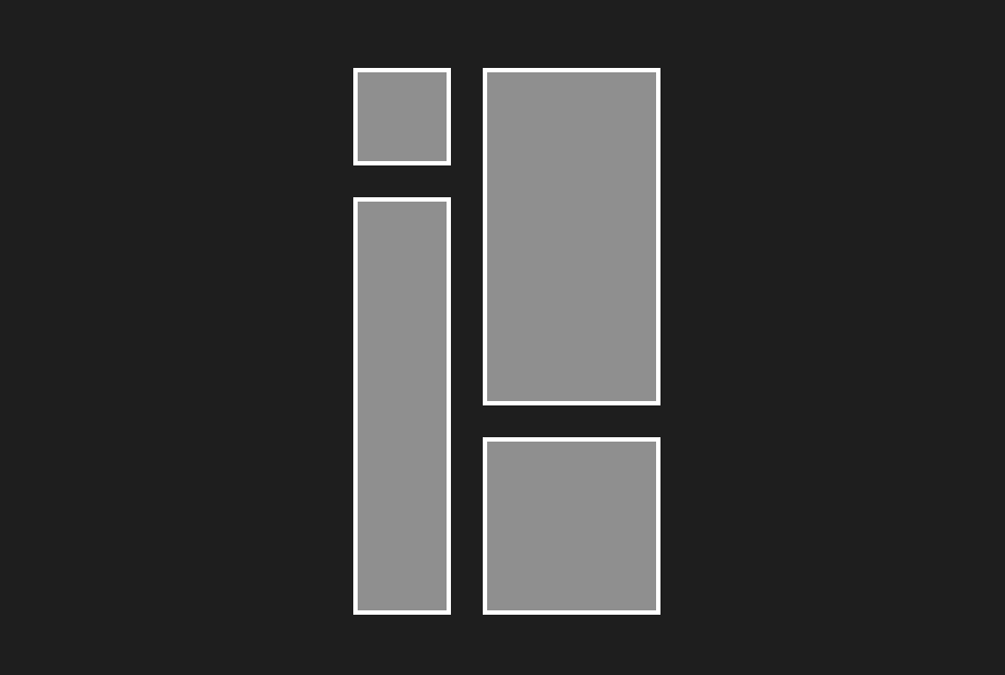
Here’s the markup for the animatable element:
<div class="container">
	<div class="row">
		<div class="square-wrapper">
			<div class="square one"></div>
		</div>
		<div class="square-wrapper">
			<div class="square two"></div>
		</div>
	</div>
	<div class="row">
		<div class="square-wrapper">
			<div class="square three"></div>
		</div>
		<div class="square-wrapper">
			<div class="square four"></div>
		</div>
	</div>
</div>
(I’ll explain why the .square elements are wrapped in a .square-wrapper div later on)
This renders the following to the page:
Most of the CSS is strictly visual, but each square has a couple of properties whose values are linked to the current scroll position:
.square.one {
	opacity: var(--animation-position);
	transform: translateX(calc(-50px + var(--animation-position) * 50px));
}

.square.two {
	opacity: var(--animation-position);
	transform: translateY(calc(50px - var(--animation-position) * 50px));
}

.square.three {
	opacity: var(--animation-position);
	transform: translateY(calc(-50px + var(--animation-position) * 50px));
}

.square.four {
	opacity: var(--animation-position);
	transform: translateX(calc(50px - var(--animation-position) * 50px));
}
The value for opacity is the value of a variable set inside of the scroll event handler. As for the transform property, it uses the animation position to move the element from its starting position to its ending position.
Now let’s take a look at the JavaScript. Note, I’ve written it in pseudo code to avoid filling the example with too much detail.
const #onScroll = () => {
	const elementsToAnimate = document.querySelectorAll('.square');
	elementsToAnimate.forEach((el) => {

		// Entry Animation range is between 70% and 90% of the viewport height
    if (elIsWithinEntryAnimationRange(el)) {
      el.style.setProperty('--animation-position', getAnimationPosition(el));
    }

		// Exit Animation range is between 10% and 30% of the viewport height
    if (elIsWithinExitAnimationRange(el)) {
      el.style.setProperty('--animation-position', getAnimationPosition(el));
    }

		// The animation is in its complete state between 30% and 70% of the viewport height
    if (elIsWithinVisibleRange(el)) {
      el.style.setProperty('--animation-position', 1);
    }

		// The element is in its idle state when below 10% or above 90% of the viewport height
    if (elIsOutsideVisibleRange(el)) {
      el.style.setProperty('--animation-position', 0);
    }
  })
}

window.addEventListener('scroll', this.#onScroll);
The full implementation requires ~50 lines of code. In addition to the amount of code I’ve written, there other downsides to this approach:
- The code isn’t portable. I need to write bespoke code for any scroll linked animations.
- The code uses JavaScript, which is fine, but we should strive to reduce the amount we’re shipping to our users
- The
onScrollfunction runs every time the user scrolls, which can be several times a second. If you’ve set multiple computationally expensive scroll handlers, your users may notice a drop in performance. - The logic can get complex. I need to add the guards myself to ensure that the animation only works within certain scroll ranges. I also need to compute the intermediate animation values myself. There are heaps of other edge cases I haven’t accommodated for either.
Migrating over to CSS
Let’s simplify the DOM by removing redundant element.
<div class="container">
	<div class="outer">
		<div class="row">
			<div class="square one"></div>
			<div class="square two"></div>
		</div>
		<div class="row">
			<div class="square three"></div>
			<div class="square four"></div>
		</div>
	</div>
</div>
The first step is to remove all of the JavaScript, including the event listener. You can replace it with a simple keyframe animation:
@keyframes appear {
	from,
	to {
		transform: translateX(var(--fade-in-start-pos-x)) translateY(var(--fade-in-start-pos-y));
		opacity: 0;
	}

	25%,
	75% {
		transform: translate(0px, 0px);
		opacity: 1;
	}
}
In short the animation does the following:
- The target element appears during the first 25% of the animation
- From 25%-75% of the animation, the target element will just sit there and look pretty
- The target element exits during the last 75% of the animation
The --fade-in-start-pos-x and --fade-in-start-pos-y variables are set inside of the .square selectors, to give each square control over its starting position.
.square.one {
	--fade-in-start-pos-x: -50px;
	--fade-in-start-pos-y: 0;
}

.square.two {
	--fade-in-start-pos-x: 0;
	--fade-in-start-pos-y: 50px;
}

.square.three {
	--fade-in-start-pos-x: 0;
	--fade-in-start-pos-y: -50px;
}

.square.four {
	--fade-in-start-pos-x: 50px;
	--fade-in-start-pos-y: 0;
}
The very last thing I need to do is link the animation to the scroll progress. I do this with the following three lines of code:
.square {
	animation: appear linear both;
	animation-timeline: view(block);
	animation-range: contain 10% contain 90%;
}
Let’s step through each line individually:
animation
animation: appear linear both
This is a shorthand animation property that:
- specifies the name of the keyframes rule we want to use,
appear - specifies the easing function,
linear, - specifies the fill mode,
both
fill-mode: both ensures the start and end styles of the animation persist on the element after the animation has finished completing. You can learn more about fill-mode on MDN.
animation-timeline
animation-timeline: view();
This single line of CSS has heaps to unpack.
For starters, this CSS property accepts two different functions, scroll() and view().
scroll() links the animation to the scroll progress of an ancestor element. By default, this ancestor element is the nearest ancestor that has scroll bars.
view() links the animation progress to the visibility of the target element.
animation-range
Finally, the last line of CSS gives fine control over when the animation begins and ends. By default the animation begins when the top of the target element enters the viewport and ends when the bottom of the element exits the viewport.
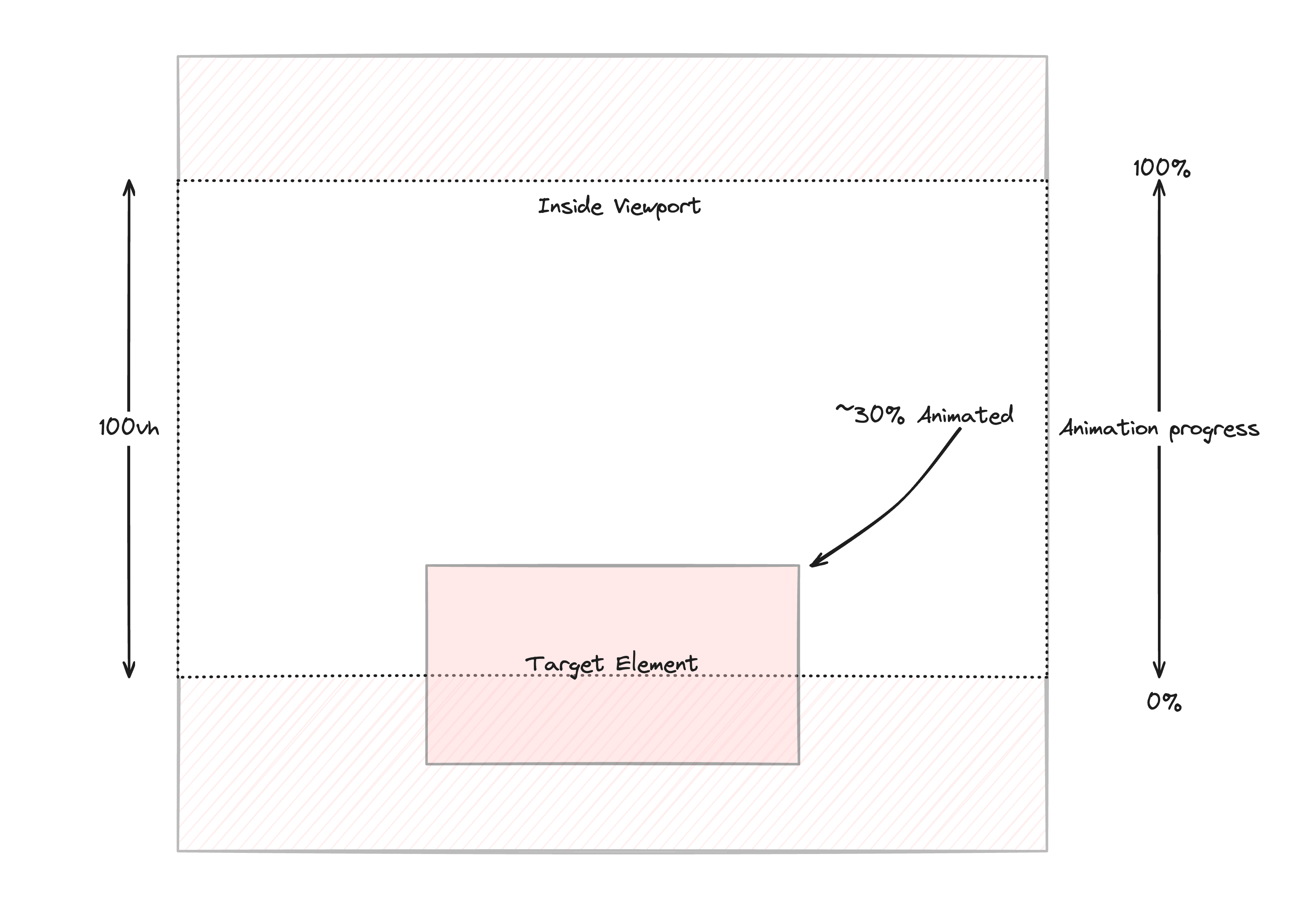
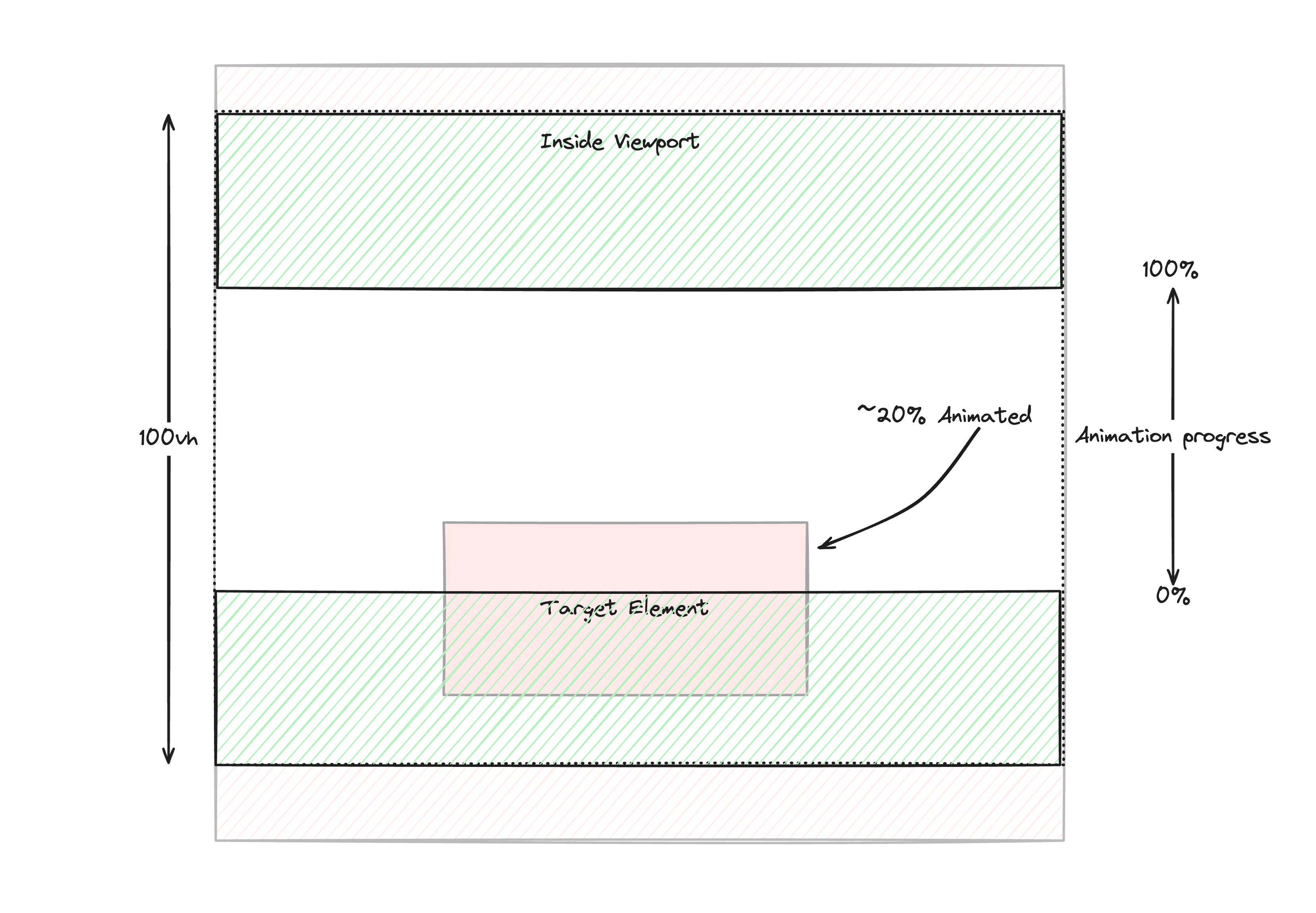
In my case, I want to start the animation only when the entire element is contained within the viewport. The same goes for the exit animation, it should complete the moment the element reaches the end of the viewport.
The shaded green section shows the threshold the element needs to pass through before the animation begins and ends.
To set this behaviour you need to set animation-range to contain:
animation-range: contain;
I want to make one more change though. I want to reduce the range of the animation timeline by 10% at the start and at the end of the animation.
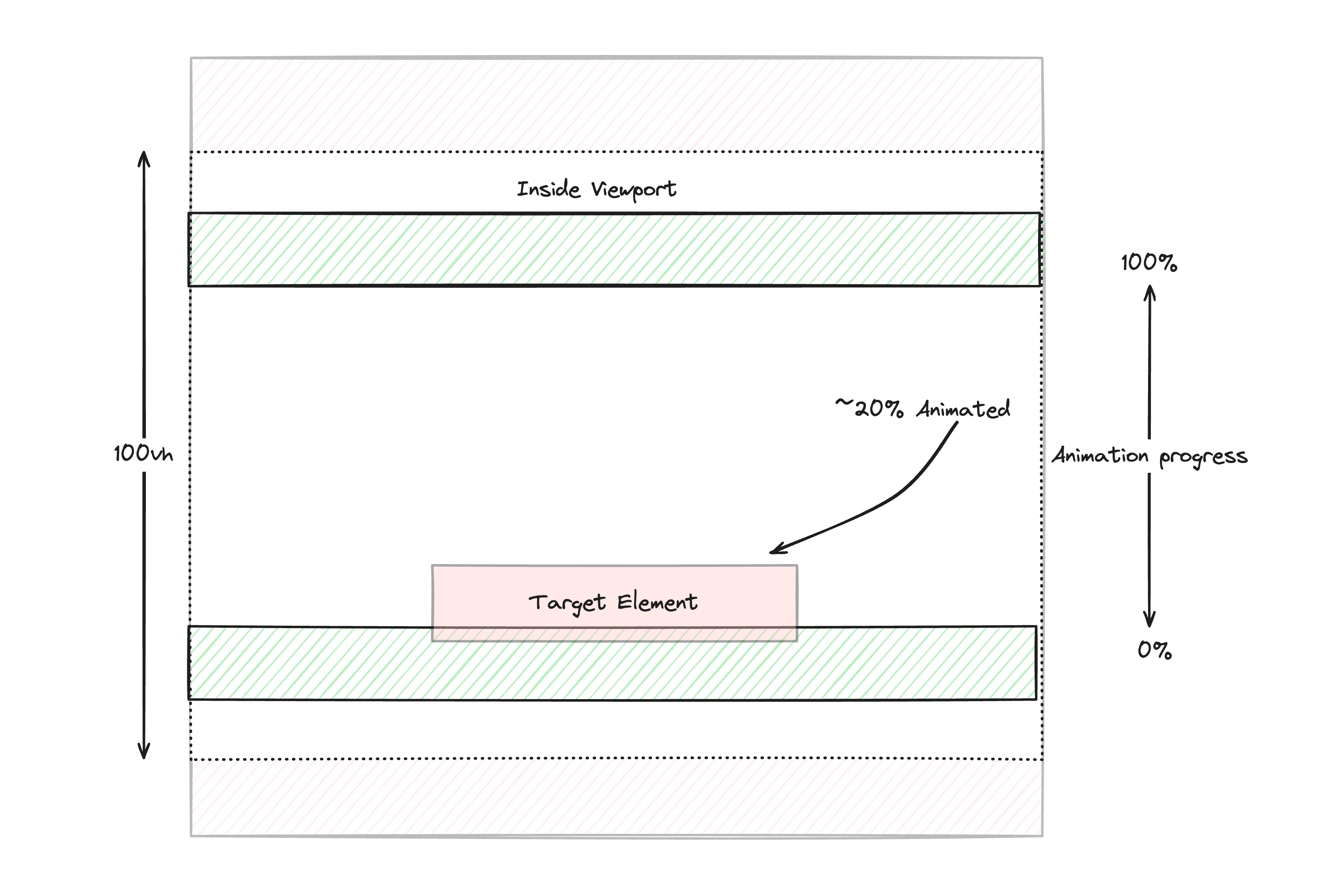
In the above image you can see that both contain barriers have been brought inside of the viewport by 10% of the viewport height.
This is done by setting the following CSS.
animation-range: contain 10% 90%
There’s a lot to take in, especially when it comes to animation-range property. I recommend checking out Bramus’s amazing visualiser to help acquaint you with its capabilities
With all that done, the animation should work nicely
And we’ve achieved this by ripping out dozens of lines of JS and adding a handful of lines of CSS.
If you enjoyed this article, and would love to learn more about Component Odyssey or other cool web development tips, then consider subscribing to the newsletter.