Improving the Screen Reader Experience for Learn WCs
First published: 22/08/2024
A few weeks back I released a site called Learn WCs. It’s a free and fun interactive roadmap for learning web components.
As most web developers will understand, there are infinite possible environments within which a site can be used. If you were to look at all the ways every single user used your site, you’d see:
- Different browsers
- Operating systems
- Input modalities
- Device power
- Screen sizes
- … And more!
It’s impossible to test every single possibility. Even as a single developer building a side project, I still try to accommodate a wide range of these possibilities.
This includes testing with a screen reader to ensure that users with low/no vision can navigate around the site.
During testing, I noticed that the screen reader experience was sub-optimal:
- Some elements were not being read out correctly.
- Purely presentational elements were being read out.
- Forms weren’t communicating their state clearly
Improving the experience required making a variety of different changes. Some were noticeable changes in the site’s markup, others involved adding visually hidden elements for screen readers, and others were workarounds for small browser quirks.
This article summarises my changes to Learn WCs site to improve the screen reader experience.
A brief disclaimer
I’m testing with VoiceOver on a MacBook Pro. Like browsers, different screen readers have subtle differences in their behaviour. Ensuring compatibility with different screen readers means becoming familiar with and testing with them. I don’t have the resources to test with other popular screen readers like JAWS and NVDA, so to ensure compatibility between different screen readers, I’ve done my best to adhere to the ARIA spec.
Across my career, I’ve had the opportunity to learn from screen reader users. I’ve learnt that there’s no one way to use a screen reader, every user behaves differently. The improvements outlined in this article may not be perfect but result in a better experience. If you’re building production applications, it’s important to get feedback from a wide range of your users.
Let’s dive in!
Better alternative content for screen readers
In Learn WCs, I went for a striking Shibuya Punk aesthetic, inspired by games like Persona and Jet Set Radio. In the hero, I have the top-level heading, that looks like this:
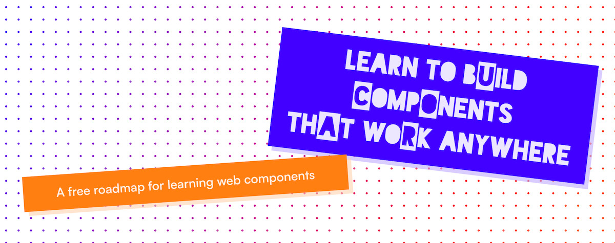
Providing a background to some characters in the title is done by wrapping them in a span, and adjusting the styles. This is what the markup looks like:
<h1>
	Learn to B<span class="alt-ff">u</span>ild<br />
	<span class="alt-ff">C</span>omp<span class="alt-ff">o</span>nents<br />
	Th<span class="alt-ff">a</span>t Wo<span class="alt-ff">r</span>k Anywhere
</h1>
It’s not clean, but it’s something I could live with if it wasn’t for how it’s interpreted by screen readers. Have a listen to this:
VoiceOver adds small pauses at the start and end of each span, which makes it difficult to discern what it’s saying.
Resolving this requires two changes to the markup:
- A visually hidden new element that contains the pure, unadulterated title
- An
aria-hiddenattribute on the existing title
<h1>
	<span class="visually-hidden"> Learn to Build Components That Work Anywhere </span>
	<span aria-hidden="true">
		Learn to B<span class="alt-ff">u</span>ild<br />
		<span class="alt-ff">C</span>omp<span class="alt-ff">o</span>nents<br />
		Th<span class="alt-ff">a</span>t Wo<span class="alt-ff">r</span>k Anywhere
	</span>
</h1>
The visually-hidden class
Visually hidden is a CSS class that removes the content visually, but still ensures that it gets announced by screen readers. This is useful, because we can ensure that the heading of the page is understandable for screen reader users, while ensuring that the visual identity of the site isn’t impacted.
Check out Scott O’Hara’s post on the subject if you’d like to understand the visually-hiddenclass in more detail.
The aria-hidden property
You can also see that I’ve used aria-hidden on the original markup. This behaves the opposite to the visually-hidden class. This html attribute ensures that the content is still presented visually on the page but is ignored by screen readers.
In this scenario, we have the best of both worlds. aria-hidden should be used sparingly though, and we’ll see why a little later on in the article.
After these changes, the screen reader reads out the title as expected:
Removing decorative content for screen readers
Just under the hero of the site is a marquee. It has a little animation on scroll, and is used to reinforce the idea that the web components you build will work in any frontend framework.
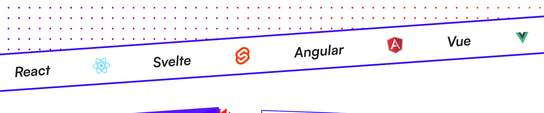
With that said, it is a purely decorative element, and doesn’t enhance the core experience in any way. In fact, for screen readers, the announcement of “react”, “svelte”, “vue”, and “angular” may even seem unusual.
Applying an aria-hidden on the marquee may not be necessary depending on who you ask. I decided to hide it based on the suggestions provided in the aria specifications
Authors MAY, with caution, use aria-hidden to hide visibly rendered content from assistive technologies only if the act of hiding this content is intended to improve the experience for users of assistive technologies by removing redundant or extraneous content.
When aria-hidden isn’t the way to go…
If you’ve used Learn WCs, you may have noticed a little easter egg. If you complete all of the lessons for some sections, you’ll get a little sticker in the hero. To give you a clear look at all the stickers you’ve collected, you can hide the title elements.
Initially I planned to hide the button and the stickers from screen readers. My rationale was that since the stickers are decorative, and the button’s effect is purely decorative, then there’s no point in announcing either to screen readers.
This isn’t the way to go. Using aria-hidden on interactive elements is an accessibility violation. This makes sense, as sighted users can also use screen readers (according to the Web AIM Screen Reader Survey). On top of that, the ARIA specs say the following:
Authors using aria-hidden to hide visible content from screen readers MUST ensure that identical or equivalent meaning and functionality is exposed to assistive technologies.
Honestly, I didn’t come up with a solution that felt appropriate. I reached out to the a11y Slack community, and quickly had some wonderful suggestions from members of the community.
I settled on Diane Ko’s suggestion:
- Ensure the button and the stickers are visible to screen readers
- Add a label to the button
- Add a description to the button, to better convey exactly what the effect is.
I also used the aria-pressed attribute to indicate its current state to the accessibility API.
Here’s the behaviour in action:
Improving accessible names
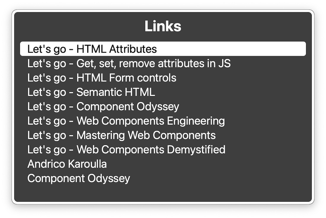
I mentioned earlier how the Learn WCs site is going for a distinct visual identity. This extends to the link copy. You can see that every link has an emphatic and colloquial “LET’S GO!”. The proximity of the link to the card’s title makes it clear that the two are associated.
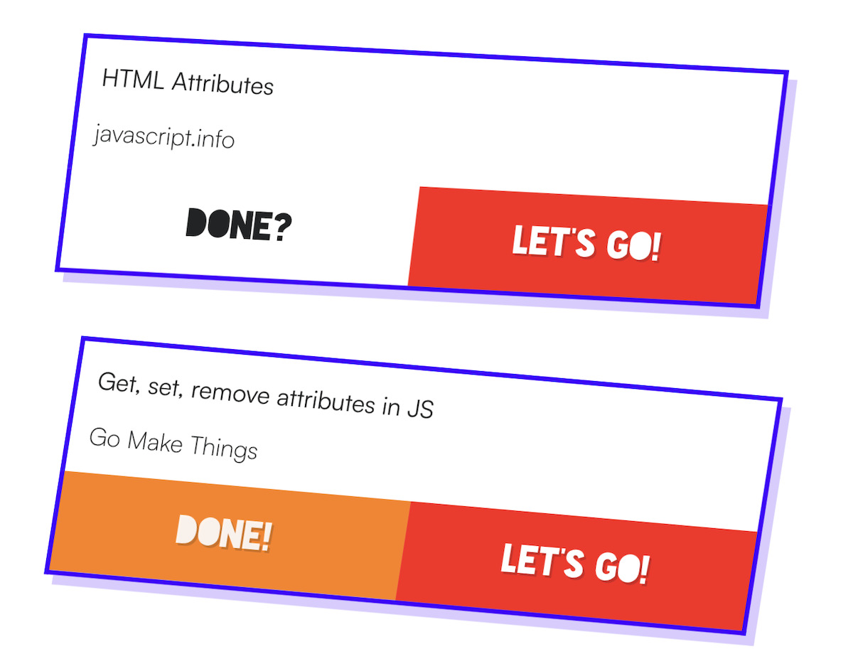
It’s more difficult to communicate this relationship in a non-visual way. On top of that, in VoiceOver’s list view, the names of the links are all the same.
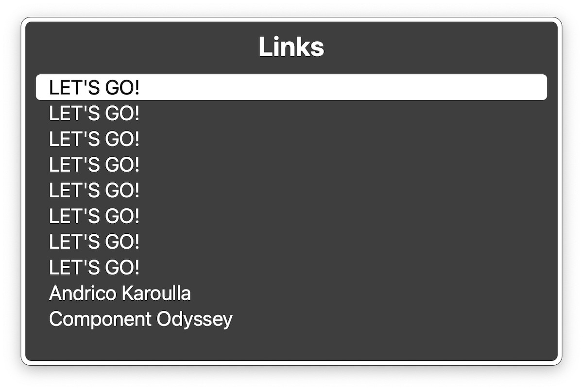
This is a quick fix. I added an aria label with the title of the article that the link directs to. One interesting thing to note, the ARIA specs recommend including the visual text within the label. This ensures that the link can be triggered through voice activation. Failure to do so is a WCAG failure.
Semantic HTML over ARIA
The beef of the site is the curated list of resources. Click the section that you want to learn more about and the site displays a list of relevant articles. Initially this was implemented using button elements.
This works fine when interacting with a mouse or keyboard, but there are a few problems when used with a screen reader:
- Clicking a button doesn’t alert the screen reader that anything’s changed.
- There’s no clear link between the buttons on the left and the content on the right
Screen reader feedback
When navigating between the dozen or so buttons, the screen reader needs to indicate which one is currently selected. Because they’re buttons, and their selected state is visualised using CSS, the information doesn’t get passed over to the accessibility APIs.
Initially, I had considered the following attributes to address this problem:
aria-checkedaria-selectedaria-pressed
None are appropriate though. According to MDN, the aria-checked attribute is only supported for the following roles:
- checkbox
- menuitemcheckbox
- menuitemradio
- option
- radio
- switch
The button doesn’t adhere to any of these roles. It’s also a good practice to avoid manually declaring and implementing roles when there are native HTML elements that can do the job (foreshadowing).
After mulling it over, I decided to reimplement the list as a set of radio inputs instead. This makes much more sense. Since radio inputs have built-in state management. The screen reader announces which radio input item is currently selected.
A shoutout to Josh Tumath for offering his feedback while I was evaluating a couple of different options.
Linking the menu with the content
After selecting an element, the screen reader doesn’t indicate a change to the list of resources on the right hand side. There should be a very clear link between pressing the button and perceiving the new content.
I considered solving this using the following options:
aria-controlsaria-liveoutputelement- Adding more verbose headings to the DOM structure
aria-controls looked like a perfect choice for what I needed to do. According to MDN:
The global
aria-controlsproperty identifies the element (or elements) whose contents or presence are controlled by the element on which this attribute is set.
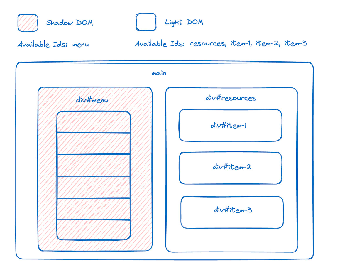
This would be perfect if not for the fact that my left-hand side menu is encapsulated within a shadow DOM. The encapsulation mechanism extends to IDs on elements, meaning that the ID specified in the aria-controls attribute won’t be able to reference the element outside of the shadow DOM.
The diagram below shows that the element with ID menu is encapsulated within a shadow DOM. As a result, it does not have access to elements with IDs resources, item-1, item-2, item-3 within its scope.
aria-live is a prospective option, as I can alert the screen reader when a part of the DOM gets updated. In this case it’s when the list of resources change after the user selects a section on the left.
I have reservations with using aria-live. For starters, the overuse of status updates and notifications gets annoying, especially when using the assertive value. There are also lots of inconsistencies with how aria-live behaves across different screen readers. Since I can only test with VoiceOver, I can’t guarantee that the behaviour I experience works across different screen readers. (This is called out directly in the Are We Live? article)
I tried two things:
- Adding
aria-livearound the resources list, but the screen reader announced the entire DOM subtree on every change, which is too verbose. - Adding a small live region to announce the currently selected section, using a
outputelement, but this repeated information announced by the screen reader when selecting a radio input.
Instead of adding potentially finicky or problematic live regions, I opted to add a visually hidden heading above the resources list, to better distinguish the link between the radio button and the resources section.
Using aria-live, sparingly
Finally, I moved over to the email form.
I learnt that providing a label to a form allows VoiceOver to set it up as a landmark in the landmarks menu. Instead of labelling it using an aria-label, I used the aria-labelledby property. aria-labelledby lets you reference the text content for an existing DOM node as the label. There are a couple of benefits to using aria-labelledby:
- You’re reusing content that’s already in the DOM, ensuring a more consistent experience between input modes.
aria-labelcan’t get automatically translated, while the content referenced byaria-labelledbycan.
This is as easy as adding an ID to the button, and referencing that ID on the form element.
<form aria-labelledby="subscribe-button">
	<button type="submit" id="subscribe-button">Subscribe</button>
</form>
Finally, after a user subscribes I append a notification with aria-live="polite" to the page. This ensures that the notification gets read out, but it doesn’t interrupt the screen reader’s current announcements.
As a little bonus, I noticed a bug where the notification wasn’t being announced when the form was submitted while the text input was focused. This is because I reset the form once the request came back as successful and VoiceOver announces this if the input is focused. For some reason, it caused the notification to not be announced 🤷🏽. So I did a hack and removed focus from the input before resetting the form values.
Wrapping Up
Thanks a lot for reading. I implore you to try the same next time you build a web site. Crack open a screen reader and see if you can perform all the actions that a mouse and keyboard user would easily be able to do.
If you enjoyed this article, then I figure you like to be kept in the loop with web development tips. If so, the Component Odyssey newsletter might be right up your alley.